
I always like making Valentine’s Cards that are a little more masculine in nature. After all…my hubby is NOT going to appreciate a lot of pink and flowers …he just wants to know that I love him. 🙂 While playing around with this Heart to Heart stamp set by Lizzie Anne Designs I decided to try out a darker, more vintage look…perhaps a more “scrappy style” if you will. I love the results…some stamping on acetate, a little paint, stitching…I’m hoping he likes it! 🙂
Today is also Thursday and time for another Ways to Use it Challenge. This week, the challenge is a rerun. With the busy days during the holidays I thought it would be a good time for one and today….the challenge is to use Stazon! 🙂 I love Stazon ink…perfect for so many surfaces. As in this card design, I mostly use mine on acetate but also love using it on glass. Stazon ink is also great for stamping and then watercoloring as it doesn’t bleed. If you’re just starting out…my favorite Stazon inks are Black and White Opaque…soooo flexible. Try them! You’ll love them. If you’d like to play along…make sure you check out the challenge at WT146.
U & I
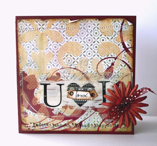
This design is pretty simple…a 5.25″ square card design layered with the beautiful Perhaps Basic Grey paper. You know how much I love those 6×6 paper pads! 🙂 The U heart I was stamped in black Stazon Ink from Tsukinkeo onto a transparency. I love transparencies…they are fabulous to stamp on and you can brush ink or paint behind them just where it is needed…sort of a layer but one that barely covers up what is beneath. Over the heart…I hand wrote “and” on a little strip of paper and then sponged the edges with Distress Ink. After crumpling the strip…I attached it over the heart with my Crop-a-dile and some eyelets. I then attached the transparency to my design by stitching the edges to the card and also added a little stitching to the top of the card. I decided to have a little fun with the bottom of the design as well…I pulled out my Just Words stamp set and stamped coordinating words along the bottom of the patterned paper. Between each word, to add definition, I added a tiny silver heart brad by Making Memories. A Prima flower, a button and some ribbon finish off the design.
Wishing you a wonderful day! Hope you have time to join us for the challenge! 🙂
15 responses to “U and I”