
I have a card sample to share with you from one of today’s Dare to Get Dirty Challenges. 🙂 JanTink’s challenge today is “Beyond the Pale”…making a pale card. No dark colors…just pale pastels and very light neutrals. I couldn’t use my Close to Cocoa or Chocolate Chip! LOL But seriously…I love the look. It is one I’ve done in the past and really should use more often.
Are you playing along with the Dare to Get Dirty Challenges? Another EIGHT cool challenges today! If you’d like to play along, make sure you check out…. DTGD Sunday challenges! 🙂
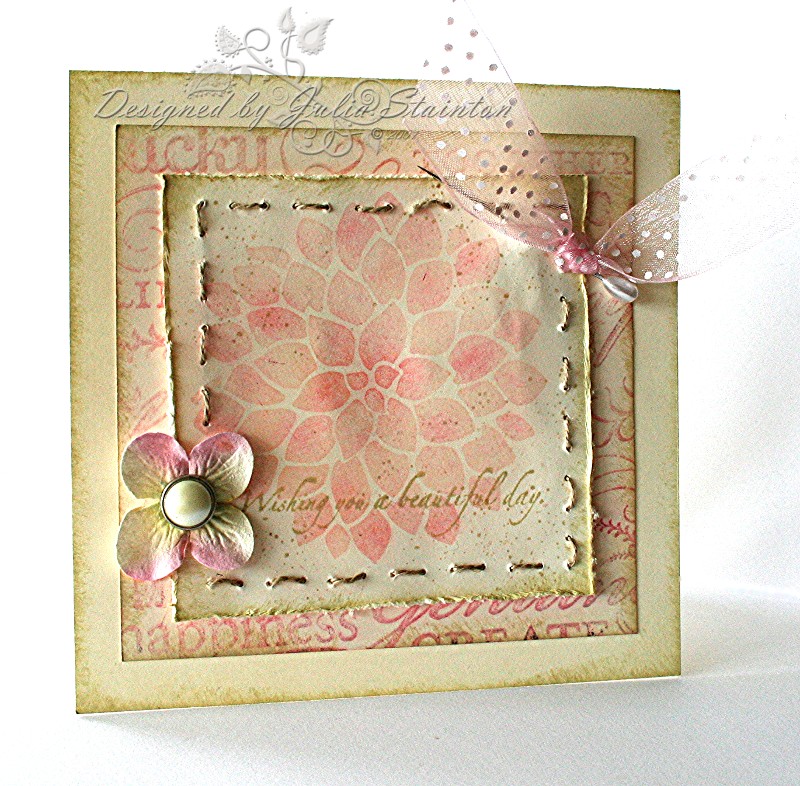
Pale Dahlia
So we’re back with another Dahlia design! 🙂 I guess I really should have chosen a different set for my sample but…. Well, I tell you the truth. I made this design first. Was very delinquent in getting yesterdays done in time. Went back to get it done, I tried using different sets but….this one just kept calling my name. I gave in…as you can tell. 😉 And so, you get the same set on two different samples two days in a row. I’m hoping you won’t care. 🙂 It is one of my favorite sets and I just love both the cards and how different both technique are. 🙂
For this design, I stamped the dahlia onto a piece of very vanilla cardstock with Versamark and applied Blush and Pretty in Pink Stampin Pastels on the image for a soft look. Using my Itty Bitty backgrounds stamp, I randomly stamped a texture over top with River Rock. The edges of all the layers were also sponged with this soft neutral and on the image layer, I added some extra distressing around the edges.
Quick Tip: With a soft, pale card…add lots of texture for interest and to help define the layout and layers.
On the middle layer, I stamped my new favorite background stamp Tres Chic with Versamark and chalked it as well. Before adhering the layers together, I pulled out my mat pack and pieced every third hole around the image. i then used Linen thread to sew around it to add more texture and interst. I love soft pretty look combined with the texture of the thread. The sentiment comes from a retired SU shell set A Beautiful Day and is stamped across the image with River Rock.
To finish up, I added some pretty embellishments. A corsage pin attaches the pale pink dotted organdy ribbon to the design. The Prima flower is from the Cherry Blossom collection and is attached with a beautiful pearl brad from K & Company.
This card design is actually paler in person and so subtle and pretty. I had to darker it up a little so that the details would show on-screen. I hope you enjoy it and hope you’ll take the time to try out the challenge! Happy Sunday!!
13 responses to “Beyond the Pale…”