Art and inspiration are all around you. From the clothes you wear, to fabrics in your home, to the ceramics in your kitchen. Everything that has been manufactured has design to it. Assuming that you purchased an item because there was something you loved about it, you can probably find some inspiration in it to use in your own designs.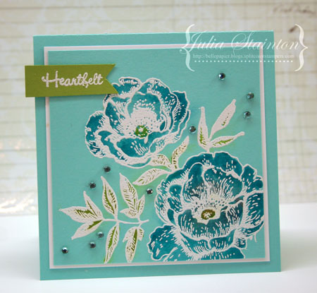
Today’s card design is inspired by a beautiful teacup I found at Home Sense. There was only one and one doesn’t usually buy just one teacup but it was so pretty that I just couldn’t resist. My favorite colors and it reminds me of the Bahamas. I pictured myself enjoying it’s beauty with a nice cup of tea or cappuccino after the kids get on the school bus each morning. And I was right. It IS a great way to start the day!

This design uses the Bazzill Card Shoppe Robin’s Egg cardstock again. I’ve stamped the image panel in Versamark Ink and then embossed it with white embossing powder. It gives the same effect as the glazing on the teacup. It love coloring in embossed designs as the raised edges make it so easy to stay within the lines and keep color from bleeding out. Dye based markers work best for coloring in. You want the color to bead off the embossing so that it doesn’t stain it. I used Tim Holtz Distress Markers in Broken China and Crushed Olive and then blotted the excess ink up with a tissue.
Just to add a little more to my teacup story… I did manage to find another matching cup a couple months later. I wasn’t long in snatching it up! Now I can have tea for two with a tropical flair.
Have an inspiring day!
Supplies:


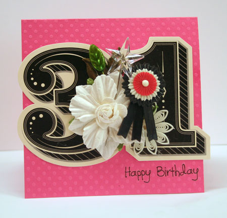
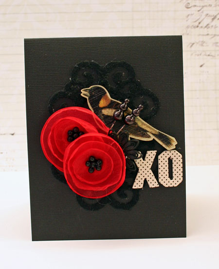
 Once again, its a mixture of old and new. Ive used the DIY Thickers to create the sentiment. They are made of white fabric covered chipboard and look lovely without any technique whatsoever.