Category Archives: Hero Arts

inspiration everywhere

Art and inspiration are all around you. From the clothes you wear, to fabrics in your home, to the ceramics in your kitchen. Everything that has been manufactured has design to it. Assuming that you purchased an item because there was something you loved about it, you can probably find some inspiration in it to use in your own designs.
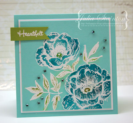
Today’s card design is inspired by a beautiful teacup I found at Home Sense. There was only one and one doesn’t usually buy just one teacup but it was so pretty that I just couldn’t resist. My favorite colors and it reminds me of the Bahamas.  I pictured myself enjoying it’s beauty with a nice cup of tea or cappuccino after the kids get on the school bus each morning. And I was right. It IS a great way to start the day!

This design uses the Bazzill Card Shoppe Robin’s Egg cardstock again. I’ve stamped the image panel in Versamark Ink and then embossed it with white embossing powder. It gives the same effect as the glazing on the teacup. It love coloring in embossed designs as the raised edges make it so easy to stay within the lines and keep color from bleeding out. Dye based markers work best for coloring in. You want the color to bead off the embossing so that it doesn’t stain it. I used Tim Holtz Distress Markers in Broken China and Crushed Olive and then blotted the excess ink up with a tissue.

Just to add a little more to my teacup story… I did manage to find another matching cup a couple months later. I wasn’t long in snatching it up! Now I can have tea for two with a tropical flair.

Have an inspiring day!

Supplies:

Just Around the Corner

Spring is just around the corner. While last week was pretty wintery, this week we’re headed for a big thaw. I’m getting a little excited thinking of nature coming to life again. What a beautiful time of year…full of hope and promise.

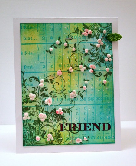
Lately I’ve been inspired by the thought of Spring and created this stamped card design featuring stamping and Liquid Applique Blossoms.

I’ve created a tutorial with step outs to share in the CLASSroom so please feel free to join me here for all the details.

Have a beautiful day!

a paper pieced valentine

We’re in the home stretch. Counting down the days until Valentine’s and more importantly in our house, my son’s wedding. I’ve been busy finalizing wedding programs and thank you’s and a few other details. I did manage to take time out to create today’s card for the CLASSroom.

It features a paper pieced background technique. I hope you’ll join me here.

Have a fabulous weekend!

Julie’s Birthday Surprise

Surprise Julie!

A very happy birthday 50th goes out to Julie Ebersole today. As long as I’ve been stamping, Julie Ebersole has been inspiring me. I love Julie’s superb design skills, her fabulous sense of humour, her kindness and her leadership in the crafting industry. I first got to know Julie through splitcoaststampers.com and was thrilled to hear from my stamping hero wayyyy back in 2006 asking me to be part of the Dirty Dozen Design Team. Wow! Can it really be that long ago?!

While I’ve never had the privilege of meeting Julie in person, I’m thrilled to be a fellow designer in the CLASSroom with her and be part of a few of her online classes. Julie’s designs are clean and simple in style but always have that great pop of spectacular that makes me smack my head and think…”why did I not think of that?!” If you’ve never stopped by her blog, you REALLY need to.

Paper Tufflez

Julie, I hope this is an extra special birthday for you. Wishing you everything wonderful! Thanks for all the inspiration. I wish I had half the creativity you do!

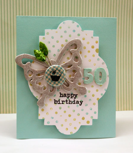
My style can be quite a bit different from Julie’s but for her birthday card, I tried to keep things a little more clean and simple in honor of Julie. One thing Julie and I do share is a love of aqua and so I just had to incorporate that color into this design.

I also know that Julie is quite partial to polka dots, just like myself and so I’ve pulled out a dotted background stamp and dabbed it with Distress Stains to create the background.

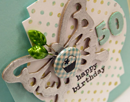
Most of the embellishments in this design have been altered. The Thickers number stickers have been colored in with a Copic marker to match the rest of the design. The little epoxy button sticker has a cupcake rub-on added to it and the chipboard butterfly has been color with a Silver Leafing pen.

I’m excited to be just one of many crafters taking part in today’s surprise blog hop for Julie. Next on the list is the very talented…

Cheiron Brandon: My Crafty Life – Cheiron Brandon

You can also find the entire list in the CLASSroom here.

Thanks for stopping by! I hope you’ll take the time to wish Julie a very happy 50th birthday. 🙂

Supplies:

smiles & flurries

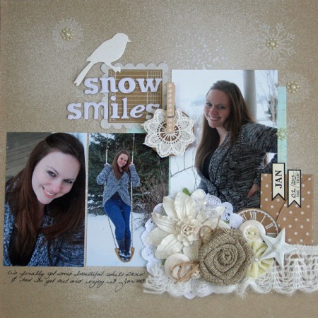
It’s cold outside and there are flurries in the air. I’m so thankful to have it as I love the beautiful freshness of winter. Might as well have some snow if it’s going to be cold, right?

The other day my daughter and I were enjoying the snow and she was kind enough to give into my nagging and allow me to shoot some photos before she left for school.

(click image to enlarge)

Today I’m back in the CLASSroom sharing this layout, and details on how it’s created. I hope you’ll stop by and join me!

Have a creative weekend!

color pop holidays

If you haven’t already started getting ready for the holidays…now’s the time to seriously rev things up. With just over four weeks left, the countdown has begun.

I don’t know about you but I’m really feeling a little behind this year. Yes, I do have quite a bit of shopping completed but absolutely no decorating or other prep done. And VERY few cards! I’m not sure what happened this year. Usually I have a ton made by now but it just hasn’t happened. It’s been a very busy fall…entire year for that matter. I think the key to staying sane through the holidays this year is just to take it one day at a time and not to try and do it all.

Perhaps what I need to get me in the Christmas mood is a little snow. It’s always so festive and what looks better with those holiday lights than a night white lawn and flurries in the air?!

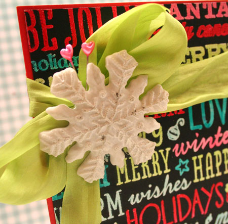
If you like Christmas lights, I hope you’ll like this fun color pop holiday card. It reminds me of lights on a cold winter night. I’m in the CLASSroom sharing this card and fun technique. I hope you’ll join me for the tutorial here.

What do you do to get in the holiday spirit? I’d love to know!

Have a fabulous weekend!

case study no. 4

I’ve said it before and I’ll say it again…

There’s nothing quite like a challenge to get your creativity going.

Being the October Muse this month for the CASE Study Challenge Blog has been an honour, so much fun and a real blessing in jump starting my love of crafting again. This is my last week to play along with the design team but I believe I’ll be playing along in the future as I find the time. It’s such a great challenge as the sky is the limit. One of the things I’ve been so impressed with it seeing all the unique designs that are created each week in so many different style. Now that’s impressive and very inspiring.

Today’s inspiration design can be found here. You’ll see that I jumped away from the layout for inspiration and focused on texture and corrugated cardstock. My original design was a different style, much cleaner but I thought a more shabby style would play up well with all that texture.

Quick Tip: Highlight textures by brushing with Distress Crackle Paint.

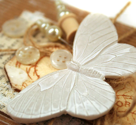
This stunning butterfly was the first piece I picked out to work with on this design. It was sitting on my desk just begging to be used and I thought that it’s subtle white color and lovely raised design would work well with a textural design. I used a hot glue gun to adhere it to the design for a firm bond.

Supplies:

Enjoy your day!