I adore lighthouses. They remind me of wonderful trips to the East Coast as a child and more recently as an adult. I’m so excited about this new stamp set from Cornish Heritage Farms called Beacon of Hope. You may have seen some of them before. It’s a compilation of images and now they are all scaled and designed to work together with each other and some incredible sentiments. This new line is called Scene-it and you’ll want to watch each month for the release as they are stunning, bring you limitless ways to stamp scenes, and put together in a set, they are an incredible value.
Sorry I’m just getting back to you with the winners of the blog goodies. I’m announcing them at the end of the post so keep reading. 🙂
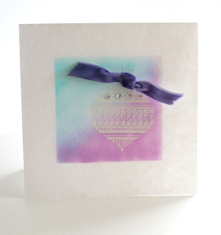
Never Give Up Hope
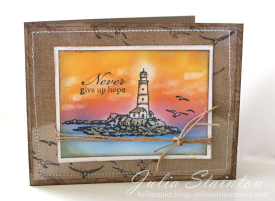
I’ve been having fun with my Copic Airbrush over the past few weeks and have gotten quite addicted to it. I know you’ll be seeing a lot of airbrushing in the weeks to come.This lighthouse background was created by stamping my image and then airbrushing over the design. No masking! I’m lazy! 😉 Because there wasn’t a large amount of white area..I simply took my Colorless Blender pen and removed the color from the lighthouse and seagulls. I used this same pen to color in clouds. To get the white glow around the light, I put my blender pen right into my airbrush and sprayed to remove the color softly.
To create my background I stamped the Cheesecloth Backgrounder onto my kraft cardstock card base. Seagulls from the Beacon of Hope set are stamped on my Clear Card Sheet layer before stitching it to my design.
This design is part of a new Craft Critique article that I’ve written on the Copic Airbrush System. If you’re interested in this product…check it out here.
Quick Tip: When airbrushing with Copic markers, make sure you use the same ink you would when coloring so that the image doesn’t bleed. I like to use Tuxedo Black Memento Ink by Tsukineko and Pitch Black Adirondack ink by Ranger is a good choice as well.
And now those winners! I used an on-line random number generator to choose two winners from the comments left. Thanks so much to everyone who stopped by!#16 Amy is the winner of the first package of goodies and #119 is Carrie…the winner of my second package of blog candy. Please e-mail me ladies with your addresses and I’ll get them out to you!
Thanks so much for stopping by! I hope you have a fabulous Friday!

Supply List:
Stamps:
–Beacon of Hope (Scene-it Collection) by Cornish Heritage Farms
–Cheesecloth Backgrounder by Cornish Heritage Farms
Ink:
-Black Memento Ink by Tsukineko
-Black Stazon ink by Tsukineko
-Brushed Corduroy Distress ink by Ranger
Paper:
-Simply Smooth White by Prism
-Kraft Cardstock by Prism
-Clear Card Sheet by Cornish Heritage Farms
Other:
-hemp cord
-sewing machine
-markers by Copic