Monthly Archives: January 2011

Pssssttttt….

I have a secret.

It’s a good one and I’ve been holding onto it for months.

I can’t wait to share.

It’s a dream I’ve had for a long time that’s coming true. Can you guess?

Nope. No more babies. Whew!

I’ll give you a hint. CHA is just around the corner. For those of you who don’t know, that’s the Craft and Hobby Association that has a huge show in LA at the end of the month. It’s where most of the new crafting products get released each year.

No…unfortunately I won’t be there BUT…I have something I’ve been working on that will.  Cool, huh?

Oh…and I’m also allowed to tell you that it’s for Lily Bee Design.

So fun! Stay tuned!

Now this card doesn’t have anything to do with my news. I just thought it went so well with the post topic that I thought I’d share it. Aren’t those little girls darling?! I adore vintage.

Supplies: Creative Scraps by Craft Secrets,  Brushed Corduroy Distress Ink by Ranger, Classic Cream Cardstock by Neenah, dotted paper by Melissa Frances, blue patterned paper by Fancy Pants Designs, blue seam binding, Crystal and Pearl Trinket pins by Maya road, Tiny Attacher by Advantus, Glitter chipboard flower by Melissa Frances, glass accent by Prima Marketing.

Take care,

my sympathies

I have to admit that sympathy cards are not my favorite ones to make. I don’t think I know of anyone who really loves making them. It’s so sad when we need them.

Unfortunately, we do need them. Making them ahead of time, makes the process so much easier. I did that with this card. Made it ahead just to have on hand.

Last week a good friend of mine lost her grandfather. I’m so sorry for her loss. I know what she’s missing. I haven’t had grandparents in a very long time. This card is for her.

This card is a simple collage using the Basic Gray Curio line. This is a stunning line with the beautiful botanical feel and a vintage touch as well. Here I’ve simply sanded and layered elements and then tucked in a sentiment stamped on vellum for a soft look.

Now just before I post the winner of the Paper Crafts Color Inspiration issue from Friday’s blog hop, I wanted to stop and say thank you, thank you, thank you for all the lovely comments left on my blog. I also have to say thank you for all the comments left on the Paper Crafts Connection feature last Monday. I was overwhelmed with your kindness. Each comment meant so much. I am so blessed.

To make things easy and fair, I used the random.org random number generator to choose the winner of the Color Inspiration issue. The number drawn was…

Which is….

Sue D on 14 Jan 2011 at 10:00 am 57

This is a fabulous color combo and your cards are beautiful.

Congrats Sue D! Please contact me with your address and your Color Inspiration issue will be in the mail shortly. The link to my e-mail is at the top of the sidebar on this blog.

Supplies: Curio 6×6 paper pad and Curio Chip Sticker Shapes by Basic Grey, vellum, Jet Black Archival Ink by Ranger, sentiment stamp from Everyday Sayings set by Hero Arts

Thanks for stopping by!

What We Love

“We are fashioned by what we love.”

It’s so true isn’t it?

The above quote is by Johann Wolfgang von Goethe, but it’s been said over and over throughout the years.

The original author? Ever read Luke 12:34?

For where your treasure is, there will your heart be also.

Sounds like the same concept to me.

Just a little something to think about. What do you love and what does that say about you?

I know that I’m convicted with that little reality check.

Speaking of love, Valentine’s Day is coming up. I thought it would be fun to create a little wall-hanging to decorate. I’m thinking I may just hang it in my craft room the rest of the year. Some things bear thinking about.

You can find the rest of my Love Spoken Here wall-hanging in the CLASSroom. I have lots of step out and close-ups to share so stop by and check it out.

Thanks for stopping by!

Have a LOVE-ly weekend,

Paper Crafts Magazine Presents: Color Inspiration for Card Makers Blog Hop

How about a little more color inspiration? I just can’t get enough of the latest Paper Crafts special issue, Color Inspiration. It’s fun and unique and while I worked on it last summer, there’s a myriad of color combos left for me to try.

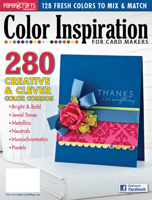
The Color Inspiration issue is filled with all manner of wonderful color combos. Some are classic, some bright and bold, and some totally trendy. I think you’ll love them! If you’re looking for this issue, you can easily find it online here.

I loved working on this issue. It pushed me out of my box and I had the opportunity to try something new. When I design, I usually start with product and not a set color combo. I admit it was a bit of a challenge to change the way I design for this issue but I’m never one to back down from a challenge. I quickly figured out how to change my design process and then had so much creative fun.

Perhaps the greatest challenge for me was keeping the exact colors organized when working on a large scale project. Little piles of product in color combo groups were all laid out down the hallway outside my craft room to keep me on track. Perhaps I would have done it a little differently if I had a longer turn-around time but with Canadian mail being what it is, my color swatches arrived on the Friday and the deadline was Monday. Whew!

Why wait for the color swatches? It was important that each designer’s project use the exact same colors to look right on the magazine spread. If you’re wondering about this process, Cath Edvalson shares a fabulous peek on Behind the Scenes: The Making of Color Inspiration for Cardmakers.

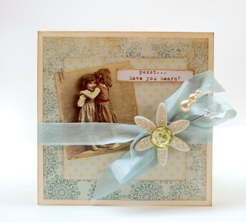
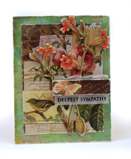
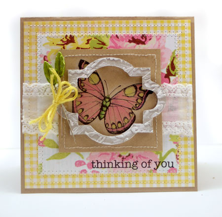
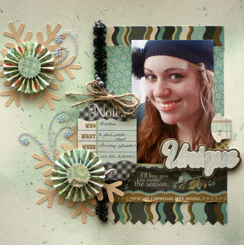
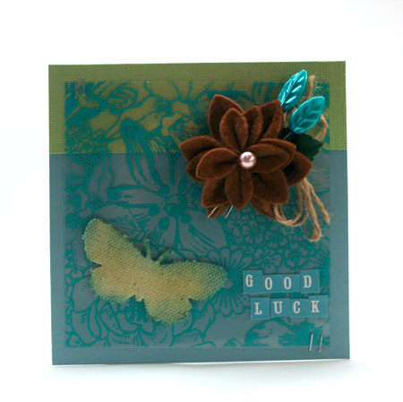
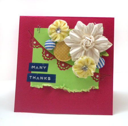
I’ve been excited to work on some color combo designs over the past week at a much slower pace. For the blog hop today, 10 of the designers that worked on this issue are sharing a new design (or two), using the color combo that you see on the cover. It’s bright and vibrant and saturated with color.

Many Thanks

{heart} u

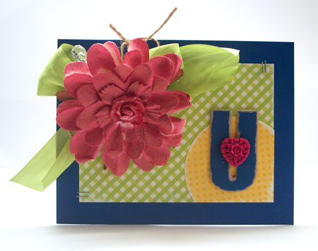
If you’re looking for exact color matches, this color combo uses the Bazzill colors Tink Pink, Great Lakes, Lemon Drop and Lemon Lime.

Now I know that some of you would love a copy of this issue. How about a chance to win one? It’s easy!

Simply comment on this blog post for a chance to win one. All comments must be posted by midnight on Sunday January 16th. The winner will be announced on Monday the 17th.

You’re also going to make sure you stop by Paper Crafts Connection today. There’s a big, big prize that you are not going to want to miss a chance at winning. Good luck!

Lastly…keep following along with the Color Inspiration for Card Makers Blog Hop. These uber-talented ladies have lots of inspiration to share.

Thanks so much for joining us today!I hope you’ll enjoy the color inspiration.

Happy blog-hopping!

The Beautiful Butterfly

Butterflies are such beautiful & timeless images. They symbolize hope and new beginnings. Is it any wonder we love them?

Today I’m back with a challenge for you to create with them. Yes, I’m back hostessing the Ways to Use It Challenge but just for this week. I’m a guest hostess as Kim is off spending time with her guy. Have fun Kim!

Feel like a challenge? I hope you’ll join me here.

This stunning classic butterfly is from the Hero Arts Antique Engravings stamp set. There are two sets by that name but this one is CL383 if you’re looking for it.

Some of my favorite stamping techniques are the easiest ones. The ones that always turn out and are quick to do. Colored pencils on kraft adds such a soft and pretty look and you don’t need to be an expert colorer to pull it off. I didn’t even use fancy pencils for this one but just rummaged around in a bin of pencils I keep for the children.

Supplies: kraft cardstock by Bazzill, Paper Girl line patterned paper by The Girls’ Paperie, sewing machine, colored pencils, trim by Webster’s Pages, Jet Black Archival Ink by Ranger, Antique Engravings stamp set by Hero Arts, chipboard frame and pins by Maya road, Snow Cap paint dabber by Ranger, embossing folder by Cuttlebug

Thanks for stopping by!

Unique

I’m unique. I admit it and honestly, I like it that way.

Imagine a world where we were all cookie cutter carbon copies. Boring.

Embrace those quirks and be yourself. There is just one you.

You’re like a snowflake.

Unique.

It’s freeing too.

We all see creative people we wish we could be like. I have quite a few. I have days where I hate my style and wish I could be so-and-so. How’s that for honesty?

So now and then I have to stop and remind myself. That I am me. I am unique and that’s OK.

There’s nothing wrong with being inspired by others as long as we don’t fall into the trap that we are not just as creative because our work doesn’t look like theirs. And truly, it shouldn’t. It should look unique.

Explore your own creativity. Find your style. Experiment. Drop your guard and just create for the joy of it.

Don’t be afraid to be…

Unique

This layout is of my unique and wonderful daughter. In some ways she’s so like me but in many ways, she’s not. She’s herself and she’s growing up and finding her way. I couldn’t be more proud of the young woman she is becoming.

I’ve created this layout with January’s Up the Street Scrapbooking Kit. I’m totally into the beautiful colors and prints Tara has combined. She has such a knack for putting a fabulous kit together. It makes creating easy.

I loved creating these snowflake details. They are die cut with the Basic Grey Snowflake Bigz die from Sizzix. Natural light was poor the day I took this photo but the die cut cardstock is a beautiful glittered cardstock that comes in the kit. It makes fabulous die cut embellishments. The rosettes are also die cut using a Sizzlets die.

Do you struggle with being unique? I hope this post inspires you to be your own creative person and enjoy the process.

Have a creative day!

color my world

Color is a huge part of my life. I think if we stop to think of it, we’ll find that this is so in almost everyones. How often do you stop and buy something to wear, just because the color is fabulous. I had to admit, I do wear a lot of black but I love livening it up with a hit of color.

When designing, I’m so thankful for an incredible selection of hues to choose from. The colors chosen really effect the end perception of the design. Yellow is happy, blue is soothing and when mixed together in a color combo, you can achieve either result depending on the hues.

Often with color,  it can be easy to get stuck in a rut. Do you reach for the same colors time and time again? It seems to be so easy to do that, doesn’t it?

Have you seen the new Color Inspiration special issue by Paper Crafts Magazine? I’m loving my copy and over the past couple weeks that I’ve had it, keep going back to it again and again for inspiration. It’s a fabulous issue!

For today’s card, I decided to try out a color combo in this issue that I hadn’t tried before. The teal color is added in with the pins and the transparency and I’ve sponged the canvas butterfly with two shades of ink to coordinate it with the background cardstock colors.

Quick Tip: When working with the color combo, think of different ways to work in colors from your combo than just cardstock. Try overlays, ink, stickers, embellishments, etc.

I’m so thrilled to have had the opportunity to work on this special issue. Today Paper Crafts is featuring a few of my designs from this special issue on Paper Crafts Connection. I’ll be answering a few questions about working on this project and hope you’ll pop by.

Supplies: cardstock by Bazzill, Raw Canvas Chipboard by Prima, Felt Flower and Leaf Trinket Pins by Maya Road, Tiny Type by Cosmo Cricket, twine, transparency by Hambly Screen Prints, Tiny Attacher by Tim Holtz for Advantus

Have a colorful day!