Nov 10 2008

It’s Better to Give than to Receive…

 jks-dream-gift-clip.jpg

The season of giving is upon us. I find that hand crafted gifts can be among the most treasured (baring electronic games ;) I do have lots of boys you know) and love creating them for holiday gifts. This particular altered wood plaque is for my daughter this Christmas. She’s chosen a new bedding ensemble as her gift and I thought this coordinating plaque would be a nice surprise. Today I’d like to challenge you to create a holiday gift and share it to inspire others. To play along with this challenge, check out the CHF Forums.

If you’re looking for some fabulous ideas…these other designers from the CHF team have created some great gifts. Check out  Julie, Kim, Dawn, Jen

Dream Gift Plaque

jks-dream-gift-plaque.jpg

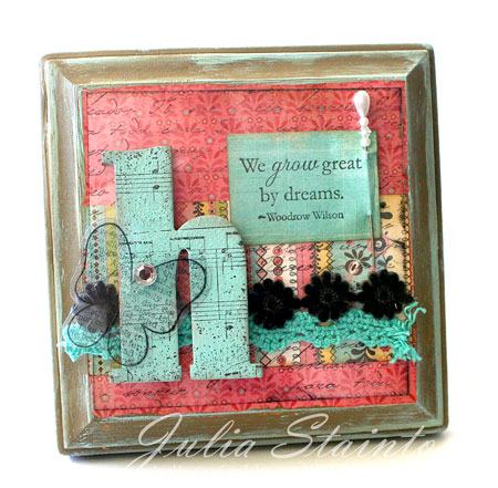
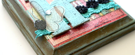
While this design looks more scrappy than “stampy”, guess how many stamps I’ve used here! Four! Can you find them?

I also used my new Urban Prairie paper pad. Didn’t I tell you I couldn’t put it down?! :)

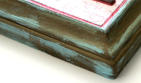
Now when I painted the edges of the frame…it seemed a little dark and heavy in the Distressed Corduroy Crackle paint but I REALLY wanted the texture and I didn’t have anything lighter that would work. Check out how I made it not only lighter, added to the texture and tied in my Aqua color throughout the design.

jks-dream-paint-texture.jpg

Have a fabulous day!

a-signature-2.jpg

Stamps:
-Aged Sheet Music Scrapblock™ by Cornish Heritage Farms
-Spanish Script Backgrounder by Cornish Heritage Farms
-Butterfly from Little Gal stamp set (Kim Hughes line) by Cornish Heritage Farms
-Motivational Centers (Mona Lisa Moments line) by Cornish Heritage Farms

Ink:
-Black Stazon by Tsukineko
-Black Memento by Tsukineko
-Brushed Corduroy Distress ink by Ranger

Paper:
-Urban Prairie 6×6 paper pad by Basic Grey

Other:
-Aqua Adirondack Paint dabber by Ranger
-Clear Card Sheet by Cornish Heritage Farms
-pin by Making Memories
-lace by Prima
-wood plaque from Michael’s
-Brushed Corduroy Distress Crackle Paint by Ranger

15 Responses to “It’s Better to Give than to Receive…”

  1. dawnon 10 Nov 2008 at 10:16 am

    I love it Julia! (and so will Heather!)
    love what you did with the frame too

  2. Angie Marionon 10 Nov 2008 at 10:44 am

    gorgeous! She’ll love it!

  3. Barb Fon 10 Nov 2008 at 11:03 am

    Just beautiful!

  4. StampinCathyon 10 Nov 2008 at 11:18 am

    This is just beautiful. She’ll love it!

  5. Jennifer Scullon 10 Nov 2008 at 12:13 pm

    I know that she will be thrilled with it! it’s gorgeous!

  6. Angelnorthon 10 Nov 2008 at 1:09 pm

    She’s going to love this Julia, it’s perfect! The texture of the crackle paint really does make the frame and I love how you introduced the aqua to lighten the effect there!

  7. Lindseyon 10 Nov 2008 at 3:09 pm

    OOOH gorgeous J!!! I love the colors, lace/ribbon, the paint is awesome too! Great job!

  8. Jennifer Ron 10 Nov 2008 at 5:07 pm

    This is beautiful Julia!

  9. Conniecrafteron 10 Nov 2008 at 5:16 pm

    so pretty, love the trims and the butterfly!

  10. Louon 10 Nov 2008 at 6:25 pm

    great job, it is beautiful.

  11. Karen in Torontoon 10 Nov 2008 at 10:55 pm

    Beautiful!! But how did you distress it? I can’t be the only one wondering exactly how you did it, can I? Or maybe I am! Please tell :)

    Karen

  12. Debbie Fisheron 11 Nov 2008 at 7:16 am

    WOW! Who wouldn’t love receiving this. Great gift!!

  13. Christina Fischeron 11 Nov 2008 at 11:36 am

    Julia, this is fantastic! I love the colors and the gorgeous details!

  14. Michelleon 11 Nov 2008 at 6:56 pm

    This is beautiful! I love it and I love the antiqued chic distressed look! Whatever you call it! LOL! I love it!~

  15. Shel9999on 12 Nov 2008 at 9:11 pm

    It’s fabulous, J! I love the aqua paint on the frame!

Comments RSS

Leave a Reply