
I just can’t seem to put down my Copic Markers these days! I think the more I use them and learn, the more I love them! I think perhaps the secret is just practice and more practice. Of course a few tips here and then doesn’t hurt either! Very fun and graphic images are the easiest to start coloring on. As you learn more about blending, you can work up to more detailed images. Copic markers are fabulous for so many things. I love using them on things like ribbons, flowers and other embellishments to get a custom color to match my design. This design was created for a Copic marker review on Craft Critique.
As today is Thursday, it’s time for another Ways to Use It Challenge. This week I’m challenging you to find ways to use Copic Markers. I can’t wait to see all your ideas. Don’t have Copic markers, why not try regular markers? Using them on watercolor paper can achieve a similar look…just call it Faux Copics! 😉 Here’s the Challenge….
Love it the Bridge
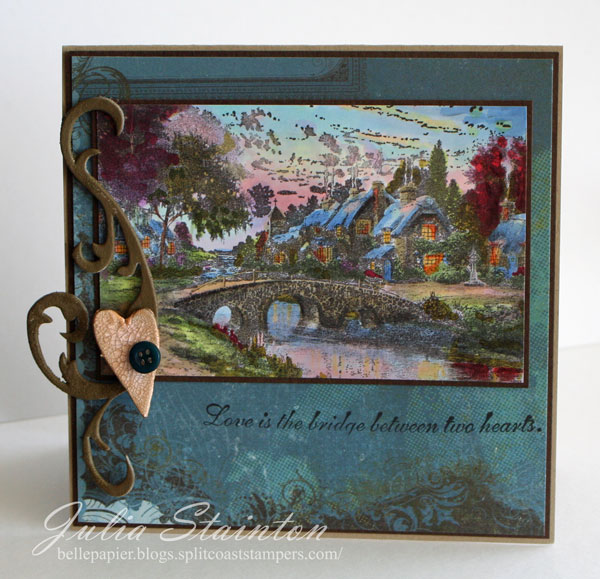
This is one of the Thomas Kinkade images I colored while on vacation. Yes, it does take a little time to get the subtle variations of color but I think the results were worth the time. Not only that, I really enjoyed sitting and relaxing while the boys were napping. I don’t often get that kind of quiet time and I think I learned quite about about coloring these images by just taking the time to do a few over a few days.
I decided that this image would make a great anniversary card for my hubby. We’ll be married 19 years in October. Yay…I’m actually ahead for once! He’s not much of a fan of my stamping but he does love the Thomas Kinkades. Actually….I had a few extra images sitting on the table with my Copic markers at the cottage. He picked up a few to try coloring them (shhh…don’t tell him I’m writing this!) and I do believe he has a new appreciation for my coloring skillz. 😉
Quick Tip: To get very subtle variations of color, color your section with the lightest color first. Saturate the paper well. To shade subtly, touch your lightest color marker nib to a darker coordinating ink to pick it up. Apply to areas you want to shade. This will not harm your lighter nib. Remove excess shaded ink onto scratch paper.
By using some dark “flourishy” patterned paper from Basic Grey, I kept this design rich and masculine looking without taking away from the coloring of this image. To highlight the focus on love, I painted a tiny heart and a beautiful Grungeboard flourish. I’m loving this Grungeboard! You could never punch out a chipboard flourish this fine!
Happy Thursday and happy stamping! Hope you take the time to join in the challenge!
Julia
Supply List:
Stamps:
–Cobblestone Bridge (Thomas Kinkade line) by Cornish Heritage Farms
–Bridge Between Two Hearts (Thomas Kinkade line) by Cornish Heritage Farms
Ink:
-Pitch Black Adirondack ink by Ranger
-Brushed Corduroy Distress ink by Ranger
Paper:
-Simply Smooth White cardstock by Prism
-Kraft and Suede Brown dark cardstock by Prism
-6×6 paper pad by Basic grey
Other:
-Tim Holtz Grungeboard
-markers by Copic
-button by Autumn Leaves
-Distress Crackle Paint