
Finding new and fresh color combos is a really easy thing to do if you just take the time to look around you. Color combos are everywhere from fashion, magazine advertisements, even your cereal box. One of my favorite places to find color inspiration is patterned paper. There are a wealth of colors and patterns out there presenting a never ending source of inspiration. Depending on how you change up your combo and the predominant color , a lot of looks that can be achieved from one piece of patterned paper. Very easy to do…I’ll show you how to put together some quick combos to try.
First of all, choose a piece of patterned paper that inspires you. It doesn’t matter whether you plan to use the paper in your final project or not. Sometimes I have created entire projects are a color scheme, planning to use the paper and then ended up not using it for more than a tiny scrap. I loved the wealth of color in this 12 x12 sheet of Crate paper (Flower from the Blue Hill Collection)
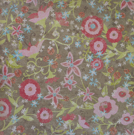
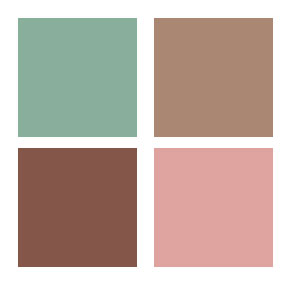
Simply go through with color swatches of cardstock and pull out the colors you want to use. Try lots of variations…it can totally change the look. Here is a few samples of what I came up with for this paper. I used my color picker to pull colors directly from the paper in Photoshop Elements. If you do it digitally, you still have to find cardstock that will be a close approximate to your color.


As you can see…I managed to easily pick out twelve 4-color combos. If I had decided to create 3-color combos…I could create even more variations. The paper I chose had fairly constant color values but some papers will have lots of graduations of the same you providing you with endless variations. Also look at the different combinations. I love seeing how just changing one color can change the look of the design. Some combos feel warmer, others cooler. Some vibrant, some subtle.
Quick Tip: One thing that I do when picking a color combo is to try and vary the intensity of the colors for balance. It can be quite overwhelming on a design if you use four dark deep colors. I like to throw in something a little lighter so give the eye some variation.
Feel like a challenge?…pick one of the above combos and create your own design OR pick a patterned paper and come up with your own combos. Have fun! If you decide to take up my challenge…be sure to link your project back here in my comments section…I’d love to see what you do!
Tomorrow I have a project to share with you that uses one of these combos. Which one? 🙂 Stay tuned.
Until then,
J
7 responses to “Choosing a Color Combo…a short tutorial”