
Yesterday was so beautiful and warm. It seems like Spring has finally arrived! It seems so strange to be finally able to get outside without a coat! Spring was definitely inspiring me yesterday when I was designing this card. I love this Spring Willow Light cardstock color. It’s somewhere between yellow and green and it reminds me of the shoots poking up through the soil. There is a Benjamin Moore paint color called Sesame that is very similar. I’m thinking of painting my upcoming craft room that color.
This main image uses Pebbles Inc. Shimmers Chalking Set for a beautiful soft, shimmering image. I tried and tried to get the camera to pick up that shimmer but didn’t succeed. You’ll just have to take my word for it…I’ve never seen chalk like it in person. For the next two weeks, Pebbles Chalking Sets are the product spotlight at Cornish Heritage Farms. I just finished it writing up and you can find information, ideas, tips and samples Here.
At CHF, our Backgrounder Blitz also kicks off tonight at 7pm EST! Make sure you join us all week for the fun, challenges and chances to win backgrounders.
Shimmery Thanks
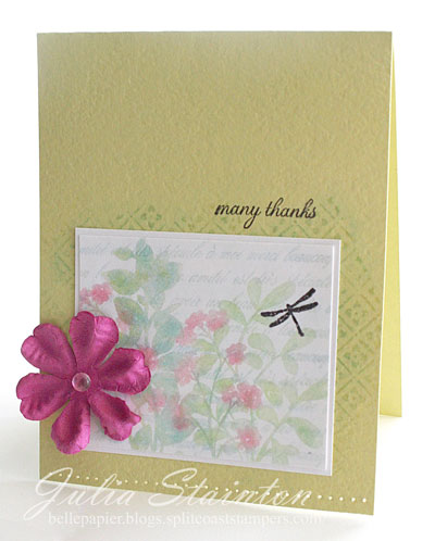
To create this design I only needed two ink pads. I love that about chalks! If you have a Versamark pad you can create pretty much any color with a soft dreamy look. To start off creating my garden, I stamped my French Script Backgrounder in Versamark on the panel. Using my chalks I went over the entire area with my light blue chalk. My flowers and foliage are from the new Kim Hughes set, Nature’s Silhouettes from Cornish Heritage Farms. To layer my foliage, I worked on each image at a time…stamping in Versamark and then lightly brushing with my Shimmers chalks. If you start by applying the lighter color and then apply the darker tint for shadows, it is easy to get a richer, more realistic look.
Quick Tip: To add some subtle definition to the layers without adding a jarring band of color to this simple clean design, I added a white mat around my white chalked image panel. This gives you a quick look of and embossed border without dragging out that die-cut machine.
I wanted to go with a clean fresh look for this design and kept the layout simple. White space 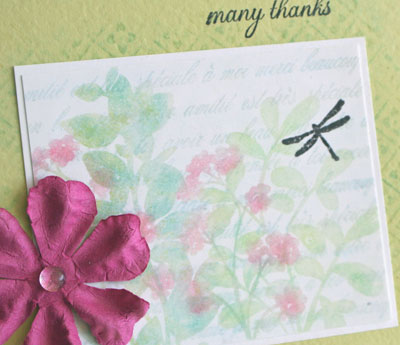 always adds to this look. Now what is called white space, doesn’t have to be white. In this case my card base is that Spring Willow Light. The clean empty space gives a visual freshness. When doing this, I always like to group my image and embellishments in one area.
As today kicks off the Backgrounder Blitz…I wanted to use another one in this design. When creating with backgrounders, you don’t always need to use the entire stamp or stamp an entire area. I randomly inked up a section of my Pretty Pattern backgrounder with Versamark ink, just a little larger than my image. After stamping I brushed it with more Shimmers Chalk to add just a hint of design. At the top, the sentiment comes from the new Script Essential Expressions and is stamped in Pitch Black Adirondack Ink.
Quick Tip 2: An extra quick tip today… this simple layout is the same layout I used on my Monday card design here. It’s so easy to turn a design 90% to get a totally different look.
Happy Friday! I hope you have a fabulous weekend!

11 responses to “Shimmering Chalks…”