Feb 12 2008

Hello Foursquare…

Published by Julia Stainton at 7:37 am under Card Designs, Cornish Heritage Farms

This morning I thought I’d share a fun card design that I created last week. This week has been so crazy I haven’t been able to sit down for more than a couple minutes at the computer and havne’t made it NEAR the stamping desk! Today my kitchen cupboards are getting pulled out and let me tell you…I just cannot wait until this is all over. We’ve been up at six and working till almost midnight each night and it seems despite my best efforts, the dust and dirt get worse each day. :( In the end, it is all going to be worth it though and I’m just keeping the end in sight. Anyone have some ideas for a kitchen paint color? This one has scratching my head. I usually know what I want! Tile is tan, kind of a natural finish, cupboards will be dark brown stained cherry and the counted a speckled black and tan granite look.

Ladybird Hello

jks-ladybird-hello.jpg

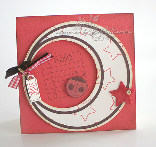
This card just kind of came together. I’d been wanting to play somemore with my EK Success Curvy Cutter Circle template. This kind of a circle cut out of a circle layout has been in my head for a while. I actually had a few of these brown circles cut out and laid them on top to see how it would look. I was shocked to find they were the exact right size to layer on top. Now how often do things like that happend?! :)

For this design I used my new Kim Hughes’ Foursquare stamp set from Cornish Heritage Farms. The star stamped natural layer, as well as the ladybug is elevated on foam adhesive. The little star is foam from an American Crafts baby embellishment set and I just colored it in with my Copic marker to make it the shade I wanted. :)

{Have a great day!}

Stamps:
-Foursquare(Kim Hughes Collection) by Cornish Heritage Farms
-Tag You’re It (the Kim Hughes Collection) by Cornish Heritage Farms

Ink:
-Red Adirondack Ink by Ranger
-Antique Linen Distress Ink by Ranger
-Burnt Umber Palette Ink by Stewart Superior

Cardstock:
-Natural Smooth cardstock by Prism Papers
-Medium Blush Red, Suede Brown DArk Prismatic cardsotck by Prism Papers

Accessories:
-safety pin by Creative Impressions
-Brown Velvet ribbon - May Arts
-foam star by American Crafts
-eyelet by Making Memories
-red gingham ribbon
-dimensional foam tape

Tools:
Crop-a-dile by We R Memory Keepers
circle cutter - EK Success

22 Responses to “Hello Foursquare…”

  1. Amy G.on 12 Feb 2008 at 7:58 am

    amazing card!! I love lady bugs. They thing that really grabs me about the card though is those amazing circles.
    Thanks for sharing.
    As for kitchen colors with the cupboards being so dark I think you have some really great options. a nice mossy green would be awesome, or a warm, deep yellow with some orangey undertones, you could even do a steel blue color. Just some thoughts on that for you. We are currently struggling with paint colors too. everything is pretty open though so it’s not just one room one color,it’s one color for the whole house. Good luck, and I’m sure it will be beautiful whatever you choose.

  2. Kim T.on 12 Feb 2008 at 8:33 am

    Love your blog. Cute card.
    Hang in there with the renovation. The dust does get a little hard to deal with. We just finished a kitchen/dining room renovation. We chose sage green with chocolate accent walls. Another choice could be terra-cotta with chocolate. It would create a warm feeling in the room.
    Good luck!!

  3. Bethon 12 Feb 2008 at 8:54 am

    This card sketch is awesome! I love everything about this! Four Square is definitely on my wishlist. As for kitchen color, sounds like you have a beautiful, neutral background so you many colors would be beautiful. I know some our local paint stores have actual little paint samples to try-out and “live with” a few days.

  4. Chriss Blagraveon 12 Feb 2008 at 8:56 am

    Beautiful fun card! Love the “movement” you created with the circles and your placement of the stars.

    For your kitchen colour, what about a “soft sky” or really soft aqua? That would help keep the room light with your cabinets being a nice warm grounding colour. I am currently selecting for 2 bathrooms upstairs and it seems I am gravitating to an aqua shade with the hard surfaces being slate and glass tile. Hope we can see pics when you are finished!

  5. Mendion 12 Feb 2008 at 8:58 am

    Julia, my kitchen sounds like it is similar to yours! I used Happy Trails by Pittsburg paint. It is a warm neutral tannish color that I love–not pink or peach at all! Good luck! Be sure and post pictures of the finished results!

  6. Joyclynnon 12 Feb 2008 at 9:35 am

    Renos can be difficult, especially if you’re doing the work. It all sounds lovely and having gone thru one myself it *will* be worth it. Hang in, good things will come soon. The last days should come together quickly… it all looks bad in the beginning and thru the middle.

    I’ve noticed you use a lot of pinks and turquoises in your designs. Go with colors that make you happy. You spend a lot of time in your kitchen and it should be a place that is inviting to you. Bear in mind though, it’s just paint and can be changed quite easily if you decide you want something else. Good luck. I hope picking a paint color is the most difficult thing you face with the reno.

  7. Kristine Reynoldson 12 Feb 2008 at 9:38 am

    Very cute Julia!

  8. Karenon 12 Feb 2008 at 9:41 am

    Just love this design - even tho’ it is mounted on a rectangular card, the feel is simply circular.
    As for the kitchen possibly a moss or sage tone to compliment the cherry stain is obvious, however, my choice would be a warm gray with a tinge of blue to finish the neutral pallette; then any accent colour would fit into seasonal decor. Good Luck!

  9. Chris Motton 12 Feb 2008 at 10:03 am

    Julia,
    Very pretty & unique card. Your kitchen will be worth it in the end..chris

  10. bronihon 12 Feb 2008 at 10:56 am

    What a great card! I love the circles! I just got that Kim Hughes set - so cute!

    As for the kitchen color - how about a warm buttery yellow? Good luck on that!!

  11. jacksonbelleon 12 Feb 2008 at 11:23 am

    This is absolutely darling J! I Love the stamps, colors, layout, just so cute!

  12. quilting-ladyon 12 Feb 2008 at 11:27 am

    Hi Julia - cute card!
    I feel your (reno) pain - we moved into this house 3 years ago, (Dec. 28th) and the week before we moved, DH finally started the kitchen reno - we lived out of boxes, and lived on take-out for 5 weeks.
    Now, I have a wonderful kitchen, and I love every bit of it. When I read your paint colour dilemma, I thought of a deep rich rust/terra cotta colour, or a deep rich blue (sort of like SU’s Not Quite Navy).

    Looking forward to seeing the finished pics!

  13. Alisonon 12 Feb 2008 at 12:17 pm

    Beautiful card, very innovative! I am loving the idea of very dark cabinets with a cheery lime green on the walls! Or even apple green. We hope to be building a new house in the next year and I would love to implement this colour combo.

    Alison

  14. Beth Mon 12 Feb 2008 at 12:17 pm

    Great card! As for kitchen color I think a nice butter cream would be great. I believe it’s an old farm house you have that you are renovating/expanding and a nice warm yellow/tan seems like a great traditional color.

    Best of luck with your color selection and living through the construction! Hope you post pictures when it’s done.

  15. Mary Joon 12 Feb 2008 at 12:32 pm

    We finished our kitchen last May. I chose a Behr paint called Pumpkin Butter. We have black granite counter tops and our cupboards are stained a light cherry. The result is yummy. I have kind of gone with a contemporary Tuscan feel and have added deep red accents at the windows, etc. You will love your new kitchen.
    Your card is great too!

  16. Veltaon 12 Feb 2008 at 3:43 pm

    Julia ~ I have been there before…I had a contractor come and remodle my kitchen, and the rest of my house…took forever…but I absolutely love it. Would do it all again. Great design on your card!

  17. Linda Grayon 12 Feb 2008 at 4:16 pm

    Love your card. Even though it is a rectangle card there is a round effect. I’m partial to ladybugs anyway. You have the same color scheme that my daughter used in her kitchen. They used a lighter tan color than the tile color. It is a very restful kitchen. She picked up color accents with her towels and curtains. I know a remodel takes forever but it is worth it in the end. You just feel like the end will never come. Hang in there.

  18. Janineon 12 Feb 2008 at 6:13 pm

    Hi Julia

    Great card. So different… Your kitchen will be so beautiful when it is done…

  19. Sueon 12 Feb 2008 at 7:57 pm

    Julia,

    I LOVE this card. I definitely have to give this one a try.

    As for the kitchen, WOW, you have received a lot of different ideas. I’d be all over the neutral tan or light yellow/moss green/burnt orangish-red color scheme. Depending on what you have for walls to paint, you might consider striping one of the walls with two or three colors in different width stripes and then do the other walls in one of the colors. Have fun with it!!! Share pics when you get it all done.

  20. Laura Canaleon 13 Feb 2008 at 3:04 pm

    This card is so fun! Sorry about the mess in your kitchen. I got new tile and counters a couple of years ago. Our kichen was only out of commission for a week and I thought I was going to go crazy…I feel your pain.

  21. Shel9999on 14 Feb 2008 at 8:35 am

    Super cute!!!! I love what you’re doing with all the circles!!

  22. trudeeon 14 Feb 2008 at 9:46 pm

    darling card with all those circles, J!

Trackback URI | Comments RSS

Leave a Reply