Daily Archives: August 30, 2007

More Pencil Work…

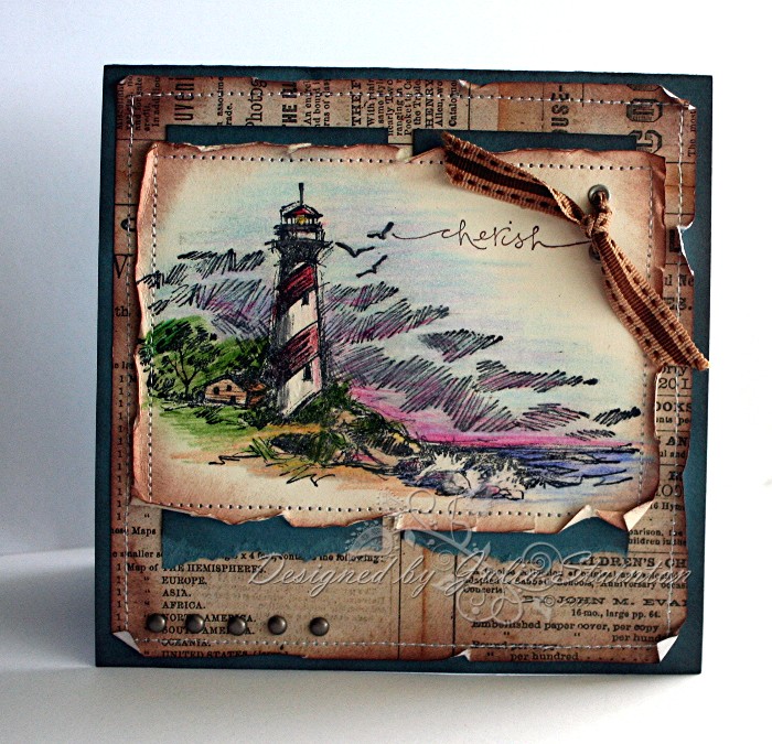
I had a lot of fun dusting off my pencil crayons for today’s Ways to Use it Challenge last night. I know I’m NOT going to let them get so dusty again! If you missed the first card I designed for this challenge…just scroll down to the previous post… it is a totally different style from this one. I love mixing things up a little. πŸ™‚ I had actually meant to post them both together here on my blog but the morning got away on me and I had to run out for errands. And so, here I am, back with my other card design.

This new set features the brand-new soon to be released Lizzie Anne Designs High Hellos stamp set. This set is to be released September 10th. It is so cute! You can get a sneak peek of all their new releases right on their web-site. While you are there, make sure you take a look around. Jacksonbelle has designed a project of the month and the Lizzie Anne Newsletters are getting revved up with lots of cool stuff and are now going out monthly. Make sure you sign up! πŸ™‚

Thinking Highly of You

jks-thinking-highly-of-you.jpg

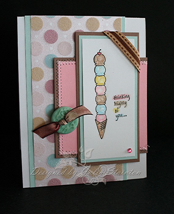
I just had to pair up this darling flocked/metallic Heidi Grace paper with the ice cream cones from the High Hellos set. The circles and colors reminded me of Baskin Robbins…yummmmmmm. My most favorite ice cream EVER is the Chocolate Mousse Royale. Oh my…I think I need a chocolate fix! I think it is the exact color of Close to Cocoa and sooooooooooooooooo creamy! Anyways…I digress! LOL

The lovely fine lines of this stamp are so easy to color with pencil crayons. After coloring the design, I gave the ice cream a slick look with my clear Sakura Gelly Roll Glaze pen. i decided the sentiment needed a little highlighting too so I colored over it in a sketchy style.

I also found the cutest button in my lovely package of Autumn Leaves buttons. This one matched up the color perfectly and I loved the texture. I tied it with my May Arts ribbon and then used another piece of May Arts to accent the corner of the image. This paper just screams for a little bling with it and so, I pulled out my Making Memories gemstones and added a tiny rhinestone to the corner to finish it off.

Supply List:

Cardstock: Whisper White, Soft Sky, Close to Cocoa, Pretty in Pink

Patterned Paper: Heidi Grace – Fiskars

Stamps: High Hellos – Lizzie Anne Designs

Ink: Black

Other: Prismacolor pencils, ribbon – May Arts, button – Autumn Leaves, gemstone – Making Memories, sewing machine

Better Sharpen Up…

Sharpen up your pencils that is! It is time for back to school and everyone know you need pencil crayons for this time of year. πŸ™‚ And so, today’s Ways to Use it Challenge is to find ways to use pencil crayons. I’m sure you all have some hiding somewhere! You can use regular pencil crayons, Prismacolors and Gamsol, and because of a request I’ve had…you get “brownie points” LOL for showing us how to use SU’s (or other brand) Metallic or Pure Color Pencils. I don’t own either so I’d love to see if I really need them or not. πŸ™‚ If you’d like to play along with this week’s challenge…check it out at WT129

You Light Up My Life

jks-you-light-up-my-life.jpg

This is a brand new Inkadinkado Lighthouse stamp that I just got in the mail last week. LOVE it! The whole sketch line is absolutely gorgeous. So gorgeous in fact that Jacksonbelle is almost totally out of the line in a couple weeks. Don’t worry…if you like them she has more on the way and they should be arriving hopefully tomorrow but definitely by Tuesday. πŸ™‚ I colored in the image with my Prismacolor pencils. I’m just using my son’s Academic line ones…much cheaper that the higher quality line but they seem to do the trick and I’ll manage with them for a while longer. I was actually going to use my Gamsol to blend the pigment but yikes…I just couldn’t find my blender stubs last night. Time for more cleaning again! πŸ™ I do like the look achieved though. With the sketched pencil lines look of the stamp, I think a sketchier look for the coloring works well. To add highlights on my Very Vanilla cardstock, I used the white pencil crayon to brighten up the splashing waves and the lighthouse. I decided to add a little touch of sunset at the end. A little pink is just peeking over the horizon and a very light touch of pink light is hitting the right side of the lighthouse.

Quick Tip: Let your black ink dry for a couple minutes before starting to color with your pencil crayons. It will smear if you don’t.

I originally started this card design as a masculine birthday design…no particular person in mind. As I went along though, I was thinking how much my husband would like it. I even had straight stitching on it. LOL If I had done free-style that would have immediately disqualified it for him! He HATES crooked stitching. He wonders why one earth I would want to do that when I can sew straight quite well. πŸ™‚ His birthday is a while off yet but I remembered our 18th anniversary is coming up in October…wowsers, the way time flies that is just not far away at all. And so…I added the sentiment cherish on the outside of the card and tied the inside in quite nicely (if I do say so myself LOL πŸ˜‰ ) with a computer-generated sentiment… “You light up my life” . πŸ™‚

I love this new SU in color blue. LOL I totally forget what it is called right now…it is that kind of morning! But I’ll be back to edit it in. Because I created a 5.5″ square card, I had a 3″ strip left over. I wanted to use it to mat my image but it wasn’t quite big enough and I just have SO many scraps laying around I did NOT want to cut into another new piece. And so, what started off as frugality (yeah right…I so full of that) turned into a design element. i kind of like it. I sponged the edges of the two strips, tore the bottom edges and then adhered my image over top.

The printed paper background is a patterned paper by Daisy D’s. I love it! I have a few sheets of it and noticed the other day, I hadn’t used any of them yet and I think it works great with a vintage or masculine look. A lot of stitching and distressing by pulling the edges up with my finger add to that look as well. For my embellishments…a little metal is always great on a guy card and so I added the brads and eyelet to the design. The brown stitched May Arts ribbon was tied through the eyelet holes.

Supply List:

Cardstock: Blue, Very Vanilla – STampin Up

Patterned Paper: Daisy D’s

Stamp: Lighthouse – Inkadinkado, Warm Words – Stampin Up

Ink: Black Palette Hybrid – Stewart Superior, Close To Cocoa – Stampin Up

Other: sewing machine, ribbon – May Arts, brads and eyelets – Making Memories, pencil crayons – Prismacolor, Crop-a-dile – We R Memory Keepers