OK I know the title sounds a bit odd at the best! LOL But this is what Sherry Cheever named her today’s Dare to Get Dirty Challenge. I was very excited to be asked to create a design sample for it. It is a beautiful technique. Not simple to be sure and so I had to deviate from my simple Saturday post. I’m sure you’ll forgive me. 🙂 I’m so excited about this design and hope you’ll like it too. Now and then you just get a design that you love and this is it!
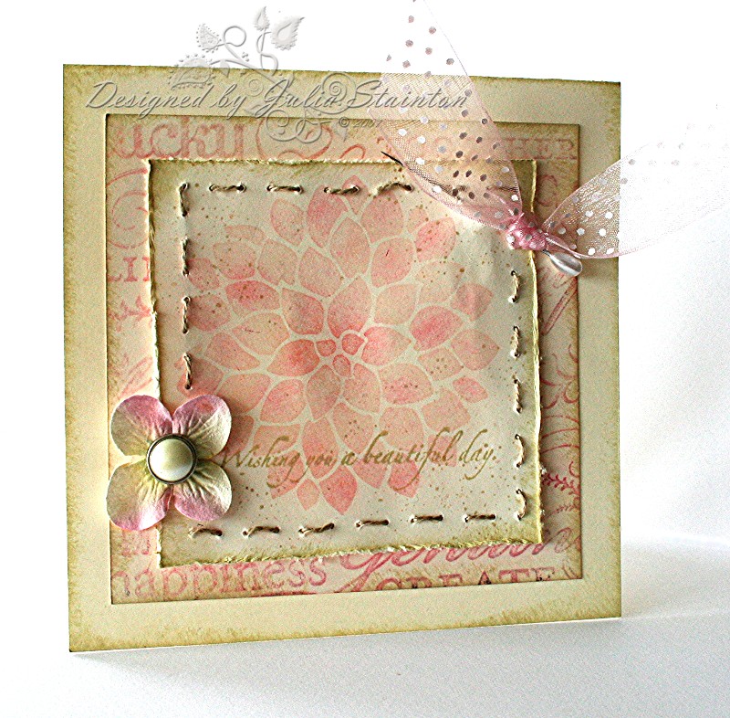
Vintage Friend
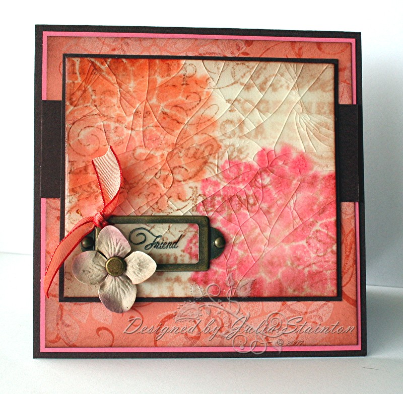
To create this design, I started off the the technique. Hmmmmm what was I going to use. You really need a solid stamp for this challenge and so, I just had to use my new Fabulous Flowers dahlia, yet again. I misted the watercolor paper and then stamped my dahlias onto it. While still damp, I stamped my Tres Chic Background stamp in Close to Cocoa over the flowers. Blot with tissue if it gets too damp. This technique gives you a watercolor or Monet look. After allowing to dry, I sponged the edges with more Close to Cocoa and then covered the whole surface with Versamark ink. This is the “cracked” part of the technique…cracked glass. Layer on clear embossing powder…I like the UTEE (extra think embossing enamel) or Glassy Glaze embossing powder for this. It is thick and coats better so that you need less layers. Whichever powder you use, heat the powder, allow to cool, then covered with Versamark and powder and heat again. Repeat until you get a nice thick glazed surface. Allow to cool well. When cool, crack surface with your fingers until desired look is achieved. If you panel is not cracking well, try cooling it more, or add extra layers of embossing powder…it may be too thin.
Quick tip: To speed up cooling for this technique, place panel in freezer for a few minutes. It will be ready to crack in no time! 🙂
For the rest of the card design, I used a simple layout. The card base is 5.25″ square chocolate chip card base. I layered it with Regal Rose and then a stamped panel of Groovy Guava. I love this color combo! So warm and yummy. For the stamped groovy guava layer, I first stamped it with the swirl from Baroque Motifs and then stamped over that with the Dahlia image in Canvas Palette Hybrid ink. I love how quick this ink dries! I recently wrote an entry on this ink, if you missed it you may want to check it out HERE.
And lastly the embellishments. You know I always love to add a few! 🙂 I decided it would be fun to add the Friend sentiment from Flourishes directly onto the cracked layer. I tried using Stazon but I just had a mess…it wasn’t a good image and it wasn’t stamping well on the UTEE. Yikes! What to do?!!! I pulled out my Technique Tuesday clear stamp cleaner and tried spraying a tiny bit on. Yay!!!! It took it right off! So now we BOTH know… don’t try stamping on cracked glass 😉 and that cleaner works REALLY well, even on Stazon!!!
So I STILL wanted a sheer look with my sentiment/Hodgepodge Hardware idea. I stamped the Friend stamp onto a piece of acetate, this time with great results. You can carefully insert brads through the embossed layer with your paper piercer and then attach the hardware. The Prima Flower/Karen Foster brad combo was attached with a glue dot and then I tied a tiny piece of my new, gorgeous May Arts ribbon to the top of the plate.
Quick note: I’ve been having trouble with my e-mail for a few days! If you’ve e-mailed me and I haven’t responded…I’m sorry! We are working on it and hope to get things working and caught up soon! We’re taking a break though with the family & I’m off to the beach again today! YAY! Hope you all have a fabulous sunny summer Saturday! 🙂
Supply List:
Cardstock: Chocolate Chip, WAtercolor paper, Groovy Guava, Regal Rose – SU
Stamps: Fabulous Flowers, Tres Chic, Baroque Motifs – Stampin Up, Flourished Words – Flourishes
Ink: Black Stazon – Tsukineko, Close to Cocoa, Groovy Guava, Regal Rose – SU, Canvas Palette Hybrid – Stewart Superior
Other: Hodgepodge Hardware – SU, ribbon – May Arts, Prima flower – prima, acetate, thumbtack brad – Karen Foster Design