
It is always so hard to see a favorite stamp set being retired. Even though you keep them, they do tend get lost in the excitement of new things. Roses in Winter has been one of my very favorite sets. So flexible and perfect for almost every occasion, it is sure to become a classic.
I actually hadn’t planned on stamping today…so much to get caught up on now that the kids are back to school. Benjamin finally started back again and has finally gotten over his Strep. I saw the color challenge though and just had to give it a whirl. Vintage Violet, Certainly Celery and Old Olive are all on my favorites list! If you’d like to join today’s color challenge, follow the CC115 link.
Vintage Roses
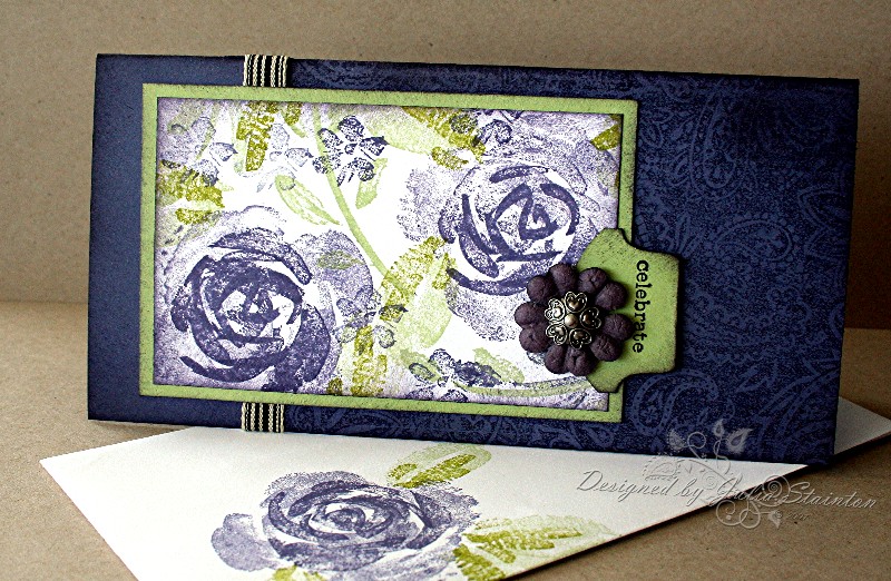
I started out by trying something new for this card. It is so easy to always use the same card size and shape. I had just purchased some new envelopes from my SU demo and thought I should try out the different shape. Long and narrow, this card measures 3.25″ x 6.5″. So easy to cut as you just cut a 6.5″ square and fold it in half. How easy is that?!
Quick Tip: If you are using a background stamp and it isn’t quite long enough for your card design….make it work by only stamping a portion of your card layer with it. Add a ribbon over the “seam” and it gives the appearance of two layers and works to help break up your design.
For the background I stamped my Paisley background stamp on the right 3/4 of the card base. I added a strip of one of my new favorite ribbons along the “seam” by cutting a small slit in the hinge of the card, wrapping it around and adhering it under my image. The ribbon is striped black and cream by May Arts and is so flexible and perfect for a vintage look, a retro look and both masculine as well as feminine style cards. My ribbon comes from Jacksonbelle.
The image is stamped on a rectangular scrap of Whisper White paper and then matted with Certainly Celery. The roses and leaves are from the retiring Roses in Winter stamp set. I love the two step stamping approach. I only used one ink color, Vintage Violet, on the roses. To do this and still get a range of color, stamp off the ink on your largest rose stamp on a scrap piece of paper before stamping on the image cardstock. This will give you a lighter look and give extra depth to your roses. After stamping the leaves in Certainly Celery and Old Olive, I sponged the edges with Vintage Violet and adhered the entire panel to the card front.
To add the sentiment, I pulled out my Round Tab Punch by Stampin Up. I love this punch and am counting on it making the new catalogue. I can’t wait to see what is in it! I stamped celebrate on the punched tab and adhered it to my image. To finish up, it is always nice to add an embellishment. I found this darling pewter style brad in my drawer. I still can’t believe that I bought 9 of them for a dollar at the Dollar Store! The little Prima is from a darling little purple bag of Primas that I picked up at my local scrapbook store. I believe it is called Prima Itty Bitty Bag.
Totally Off-Topic: For those of you who wish to view my Papercrafts Online Father’s Day Card, the link is now live…. No Matter How Tall Card.
15 responses to “Vintage Roses”