Archive for April, 2007

Apr 26 2007

Tagged Again…

Published by Julia Stainton under Card Designs

It seems as if there is a new version of blogger tag…this time to it is to reveal seven things about yourself! I’m not quite sure what to reveal! LOL I don’t lead a terribly exciting life…but I love the family God has blessed me with! I’ve actually been tagged three times now in the past two days. Sorry I’m so slow at getting this entry written but I STILL have some sick kids here…not fun! I think this is finally everyone though and hope things will get back to normal soon! So……things about me….

  1. My favorite courses in High School were Math & Art
  2. I’m not a coffee drinker but I love a cup of French Vanilla to start my day.
  3. I don’t have my ears pierced.
  4. My favorite time of day is first thing in the morning…I am SO not a night-owl.
  5. I won the photography award in high school…now if I could just get the hang of taking good photos of my designs, I’d be happy!
  6. I learned to play piano but rarely play now.
  7. My favorite dessert is Mocha Cheesecake…I’ll have to share the recipe with you next time I make it!

I hope my fellow bloggers don’t mind….I’m exhausted dealing with everything this past week and I’m not going to look for blogs to tag. Forgive me! If you haven’t been tagged, consider this post your tag and tell us seven things about you!

2 responses so far

Apr 26 2007

Orchid Opulence…a challenge…

Published by Julia Stainton under Card Designs, Challenges

For today’s Ways to Use it Challenge on Splitcoaststampers.com , it was suggested that I issue a challenge to find ways to use Orchid Opulence. Orchid Opulence is a color of ink and cardstock that is part of Stampin Up’s Bold Brights color family. It seems that many people have trouble using this color and it is one that I rarely use myself. In fact, I commited to the challenge, went up to my desk to create and then couldn’t find any Orchid Opulence cardstock…it seems I have never purchased any after I used up my inital assorted cardstock order! Yikes! What to do?!

If you’d like to join us by creating a project for the Ways to Use it Challenge…all are welcome. Just follow the link here.

Orchid Wish

jks-orchid-wish.jpg

To start off this card…I was pondering what to do! Obviously I’d have to make up for my lack of Orchid paper some way! The Orchid Opulence and Rose Red color combo popped into my mind…I always like pairing up odd color combinations to see if I can pull them off! I added chocolate chip as it has become “the new black” to me in a lot of my designs. I also thought it went well with the fun color combo…giving it a retro look. I also was thinking about trying to use a patterned paper with this design and this fun striped Rob & Bob Studio paper came to mind. I ran to my closet…sure enough…it worked perfectly! Finally something was going right!

 I decided to use Rose Red as my card base and went with a 5″ square card design as I seem to find them the easiest for me to work with. The striped layer came next to tie it all together but I still needed an orchid layer to make it work. My background stamps came to the rescue. I went through my pile trying to find the right one. I needed a stamp with lots of inking up space to get enough Orchid presence on my card. I came to the retired Linograph stamp…perfect! Fun retro feel and lots of rubber to ink. I really wish Stampin Up hadn’t retired this background stamp after only one year! It was one of my faves and had such a great feel to it for many different projects!

After matting my layers and watercoloring my image, it was time to decide on embellishments to pull it all together. I found some Orchid grosgrain from a Michael’s clearance bin in my ribbon stash and tied it through eyelets that had been set with my Crop-a-dile. You know how much I love Primas and I just had to try out my brand-new Barbado Caribbean Collection flowers from Jacksonbelle. Imagine my delight to find there were flowers with both Orchid Opulence and Rose Red touches to them! I put them both together to create a fuller blossom and set them with a Thumbtack Brad from Karen Foster Design. My friend Michele, Shel9999 inspired me to buy a package of these and now I am seriously hooked! As a last finishing touch…I added a wavy line of stitching to the bottom of my design to tie it all together!

Supply List:

Cardstock: Rose Red, Chocolate Chip, Whisper White - Stampin Up

Patterned Paper: Rob & Bob Studio Slab - Provocraft

Stamps: Stamping Bella, Wish - Hero Arts, Linograph - Stampin Up

Ink: Basic Black, Orchid Opulence, Rose Red, Chocolate Chip, Blush Blossom, Sahara Sand - Stampin Up

Other: Prima Flower - Prima Marketing, Thumbtack Brad - Karen Foster Designs, sewing machine, white eyelets - Making Memories, Crop-a-dile - We R Memory Keepers, ribbon - Michael’s

8 responses so far

Apr 25 2007

A Little Princess…

I just love the book A Little Princess by Francis Hodgson Burnett…same author as The Secret Garden. I remember being fascinated with the rags to riches story as a child and read the book many times imagining I too was a princess. And what little girl doesn’t daydream of being a princess? Too soon life passes by this magical time & doesn’t every little princess deserve to feel like one, even for a little while? When I saw this darling new line of papers from Die Cuts with a View…I just knew I had to make a frame with it. I just love the glittery crowns and the rich royal colors. The even have the most beautiful coordinating rub-ons I just couldn’t resist!

Beautiful Princess Frame 12 x12 inch frame

jks-beautiful-princess-with-watermark.jpg

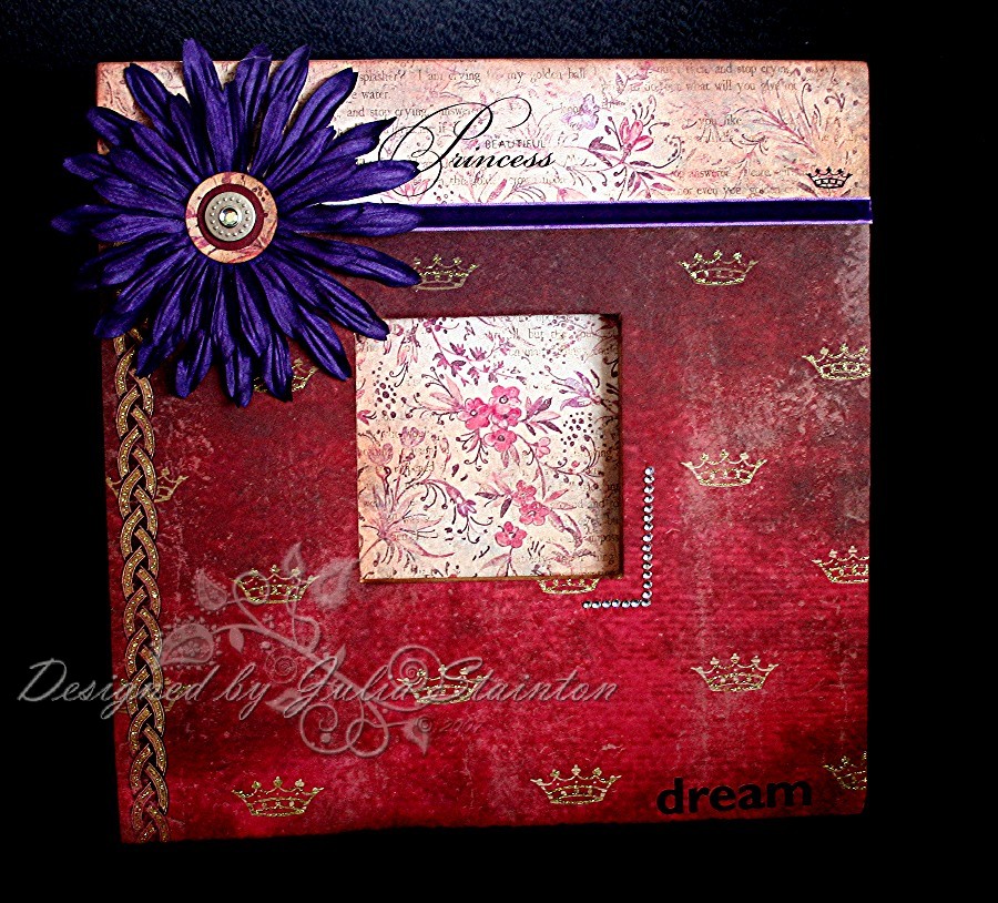
For this frame I used a large Provocraft wood frame. It is 12×12 inches square with lots of great surface area for embellishing! I covered the wood frame with Alene’s Thick and Tacky glue and smoothed on my patterned papers. After sanding the edges smooth, I then sponged all the exposed wood edges and edges of the paper with Close to Cocoa ink. I just adore this beautiful purple velvet ribbon I purchased from Starlitstudio and adhered it over the paper seam. The gorgeous huge flowers are by Prima and I bought them from Jacksonbelle. I punched a small circle of Bravo Burgundy and a larger circle of the patterned paper and sponged there edges. Using my Crop-a-dile, I set them all together with a beautiful Designer Eyelet from We R Memory Keepers. I just love the rhinestone center….a little princess needs some jewels, of course! To add a little more bling….I used strips of gemstones from Hero Arts to “frame” the bottom corner of the photo opening. For my final touch…the validation that every little girl would love…a “Beautiful Princess” rub-on was applied to the top left of the flower. I also added a “dream” rub-on from Royal & Langnickel Sentiments to remind her to dream!

Supply List:

Cardstock: Bravo Burgundy - Stampin Up

Patterned Paper: There Lived a Handsome Prince & Botanical Script Print - DCWV (Die Cuts with a View)

Ink: Close to Cocoa Classic - Stampin Up

Other: 12×12 frame - Provocraft, Violet Velvet Ribbon - may Arts, Gemstones - Hero Arts, “Inspire” Rub-ons - Royal and Langnickel, Princess rub-ons - DCWV, circle punches - EK Success, Designer Snap “Baby Boy” & Crop-a-dile - We R Memory Keepers, Big Box Blooms Odyssey #1 - Prima

15 responses so far

Apr 25 2007

A Stampin Up Research Opportunity!

Published by Julia Stainton under Blog Misc

 I received an e-mail last week and just got around to verifying it today. It was an invitation to my blog readers to apply for….

Stampin’ Up! is currently looking for 450 stampers who are willing to participate on a market research panel on stamping and crafts. Stampin’ Up! mails panelists a free goodie box every three months in exchange for their opinions”

Sounds great to me! Wanting to be careful it wasnt’ too good to be true and sending you all for a loop, I phoned Stampin Up today and verified it. It’s the real deal. Here’s the details! I applied…hope they pick me!:)

More information for your readers:-

-Stampin’ Up! uses your feedback for research only and does not share your answers or personal information with anyone else.

-Panel members can expect to serve on the panel for three to nine months. 

-There is no cost for you to join.

-Your only duty as a panel member is to answer a short survey every one or two weeks.

-You will never be asked to purchase anything to participate in the panel.

-Daily operation of the panel is managed by Volt Marketing, an independent research agency.

-You can quit the panel at any time.

-We are looking for 450 panel members. You will be selected to join if your background matches our research needs. 

We are now accepting a limited number of new panelists. You can apply for a panel position by visiting www.stampsurveys.com

6 responses so far

Apr 24 2007

With Sympathy

Published by Julia Stainton under Card Designs, Challenges

I finished it…the card I started this morning! Today’s Color Challenge was to make a sympathy card with Virginia Tech colors for one of the families who have lost loved ones in this senseless tragedgy. I know it has touched people across the US, Canada and other countries as well and our hearts go out to those who have experienced this tragedy. If you are interested in joining in this challenge, the link is here.

Virginia Sympathy click to see enlarged detail of butterfly

jks-virginia-sympathy.jpg

I decided to keep this card simple…one, I just don’t have the energy for anything complex. Two, the strong colors of this challenge seemed to work better in my mind with a simple design, and three, I fell that sympathy cards seem to by more soft and soothing if they are not too busy. This card is made from Very Vanilla cardstock in a 5″ square format. The layers are Bravo Burgundy and Pumpkin Pie, the colors of Virginia Tech. I added a top large vanilla layer with lots of open space for the butterfly to “fly”.  I love the look of open space in a design…sometimes it can be a little intimidating…I often fill up all the space with so many elements and forget that simplicity is beautiful too.

The flower was stamped with black ink and the watercolored with my Aquapainter and the ink pressed into the lids of my ink pads. I then stamped my sympathy sentiment with the Bravo
Burgundy and added a little Prima flower from the Prima Essentials Lucid Collection that I purchased from Jacksonbelle. The stitched ribbon is a beautiful green and it is from Starlitstudio. To finish off my design, I “inked up” the butterfly with my new Essential Glue pad by Tsukineko, stamped it on the card and then covered it with clear glitter. I was extremely impressed with the detail and shimmer that I achieved. I was quite honestly a little nervous, seeing as my card was almost done and I had never tried the glue pad with an intricate stamp and also clear glitter. I just love the result and wish you could see it in person! I wanted the shimmery butterfly to represent hope and their loved one who would always be with them in memory. For more details on the new Essential Glue Pad see this entry…Glitterama.

12 responses so far

« Prev - Next »