Archive for April, 2007

Apr 30 2007

Lizzie Anne New Releases…check it out!

Just wanted to let you know that Lizzie Anne Designs has a sneak peak of their new releases on their website! Super fun! I have quite a few on my wishlist that I just can’t wait to try! It  you want to check it out…here are the new releases!

Also new on their web-site, Lizzie Anne has just added their design team. I’m so honored to be working with such talented stampers!

5 responses so far

Apr 30 2007

Framed Again…

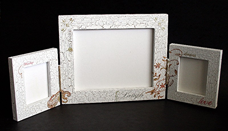
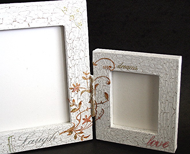
Another frame! I’ve been having so much fun altering frames! You may be wondering why I’m making so many all at once. They were all designed for an article I wrote for Craft Critique, an on-line site developed by Sarah Moore. Craft Critique is a “collective of experienced crafters (some professional, most not) with strong opinions to share on the craft supplies you want to learn more about.” I’m so excited to be part of the Craft Critique team! My first article written for Craft Critique is on Provocraft Frames. It was just posted today and you can check it out on their web-page. If you are looking for instructions for the other frames in the article, two are posted in articles in the past week and the fourth will be tomorrow’s entry.

Follow Your Bliss Frame

jks-follow-your-bliss-mini-frame-with-watermark.jpg

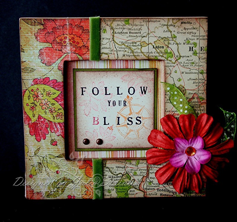
I designed this frame around one of my favorite Provocraft frames…a small, inexpensive 5″ square wood frame. I also came across the retired map paper in a 6×6 paper pad while I was cleaning my desk. I set it aside and almost gave it away, when it came to mind the map paper would be perfect with my friend Trudee’s favorite quote and blog name…Follow Your Bliss. This little frame is for Trudee’s birthday…not till July…but with how crazy things have been lately, I thought ahead of the game for once would be a good thing!

I was so excited to find the new Aged Florals Line from Fancy Pants matched the colors in the map paper beautifully. I know that Trudee loves this paper, as do I. I bought my Aged Florals paper from Jacksonbelle. After adhering the paper to the frame with Alene’s Thick and Tacky Glue, I sanded the edges and then sponged Close to Cocoa ink on the edges. I found some beautiful Primas and glued them together with glue dots and added a Making Memories gemstone for the center. I just love the Fushia and Pumpkin color combination. You wouldn’t think that it would work but it looks stunning in person. I tied a dotted green organdy ribbon (also from Jacksonbelle) around the frame before adhering my flower over top.

For the center of the frame, I used the striped paper from the Aged Florals line for a background and then created a square central image on Very Vanilla cardstock. I stamped the Follow your Bliss quote with Mini Formal and Small Formal Snap stamps and highlighted the B by inking it with Pink Passion. For the images, I wanted softer versions of the color combo so I wouldn’t take away from the quote. I inked the compass stamp in Pumpking Pie and then stamped it off once on some scrap paper. I then stamped the second impression onto my design to get a lighter shade. This is called “stamping off”. I also used second impressions for the floral stamp in Pink Passion. I then used my Itty Bitty Backgrounds random dots stamp to add a little texture and to fill in the design and sponged the edges of the layer with Close to Cocoa Ink. To finish it off, I matted the quote layer with Old Olive cardstock and inserted two copper brads before adhering it to the striped background. I’m really excited about this little frame! If it wasn’t specially designed for Trudee….I just might have a hard time giving it away!

Quick Tip - To get lighter variations of the same color without buying extra ink, just ink stamp, stamp once onto scrap paper and then stamp again without reinking. An easy way to get a lighter but coordinating color from the same ink!

Supply List:

Cardstock: Old Olive, Very Vanilla - Stampin Up

Patterned paper: Retired K & Company 6×6 pad, Fancy Pants Aged Florals Line “Lovebird” & “Enchanting”

Rubber Stamps: Small and Mini Formal Snap Stamps - Karen Foster Designs, Carte Postale - Stampin Up,

Ink: Close to Cocoa, Pumpkin Pie, Pink Passion

Other: Velvet ribbon - Flair Designs, Copper Brads - Making Memories, Dotted green ribbon - unknown, Prima Essentials Lucid Collection - Prima Marketing, gemstone - Making Memories

13 responses so far

Apr 29 2007

Scrapbooks Etc. {C’est Bon!}

Published by Julia Stainton under C'est Bon

I thought from time to time, I’d share little glimpses into places I get inspiration or things I think are worth looking into. A little review or just things I enjoy.  I’ll be calling these {C’est Bon} ….it’s good, so if you are interested, keep reading or just pass it by…it’s your choice.:) 

For the most part, I no longer scrapbook because of time-constraints. There is though, one magazine that I still love to purchase every issue of…Scrapbooks Etc. by Better Homes and Gardens Creative Collection Publications.  Scrapbooks Etc. always has great fresh ideas for hte papercrafter. The styles, colors, embellishments…you can translate any of these touches into all aspects of papercrafting. They have great product reviews…just lots of cool stuff. Even if you don’t scrapbook, take a peek…you just may find something you enjoy!

The latest issue of scrapbooks etc. (May/June 2007) is filled with great ideas! The theme of the issue is stamping! Here are some things you may want to look at…

  • For any of you scrapbookers that also stamp, this is a fabulous issue filled to the brim with ideas on how to combine the two!
  • If you are a beginning stamper, this issue is filled with loads of stamping techniques that you can use on any stamping project.
  • The Supply Smarts monthy article is always a featured scrapping kit used to make a few layouts, cards and other projects. This month it features STAMPIN UP! A fery good article on SU’s Party Pieces page kit!
  • One of my favorite columns is Goods - Show & Tell which features great new products! Can’t imagine why I’d like that column! wink! Some of the featured products this month…Queen & Co. new felt ribbon….yummm!, Cosmo Cricket Dutch Girl line, some cool Hampton Art Limited Edition Art Warehouse stamps (I need these!) and the new Fiskars Easy Stamp Press (anyone try this…I’m dying to know!) and many others.
  • Page 81 starts a great article on things to stamp on…some great ideas here!
  • Page 51 A featured scrapping space that has some great storage features

Scrapbooks Etc. also has a fabulous web-site worth checking out! Lots of fabulous tips and techniques here. Sign up for their weekly newsletter if you enjoy it. The one thing I’ve really been enjoying when time permits (now that I have high speed interent!) is their daily video segments found on the site. Super cool!

6 responses so far

Apr 28 2007

Off on a Tangent…

I’ve been having so much fun altering frames the past few weeks, I just had to try something I’ve wanted to try for a very long time…a painted faux crackle finish. I found some crackle medium while I was doing some spring cleaning and decided to procrastinate no longer! I can take ONE day off from papercrafting, right?!

Aged Frame

jsk-crackled-finish-frame-smaller.jpg

For this frame, I started off with the Team Frame by Provocraft. I love how it has the brass-tone hinges and that tiny frames on the sides. The frame comes pre-finished with a white paint that makes it great for a quick alter. If you have limited time or are just starting out, this is fabulous. I also couldn’t believe the price, only $7.99 Cdn! If you live in the USA and happen to know the US price, I’d love to know it. I purchased the frame at Michael’s.

This frame was a bit of an experiment for me. It has been a long time since I’ve done any painting on wood and I’ve never tried out a faux finish. I found some Butter Pecan colored acryilic paint by and decided that would work well with the white. I actually started off thinking I’d do the pecan as a top coat and just leave the original white primed finish to show through the cracking. I painted the crackle finish directly onto the original white and let dry. I then coated it with the Butter Pecan acrylic paint. I have two problems…..the butter pecan turned out much darker than I expected and I hadn’t put enough of the crackle medium on to get much of an effect. Hmmmmm…..

I decided another couple coats couldn’t hurt much at this point and I just wasn’t about to give up yet! I painted right over the Butter Pecan layer with another coat of the crackle medium…this time much thicker and headed off to bed. This morning I got up, quickly found some white Making Memorie’s acrylic paint that I use for scrapbooking and painted over top of that. Just so you know, each coat takes VERY little time to apply and since you are going for a distressed finish, you don’t need to be super-fussy! With-in minutes, the cracked finish began to appear. I was so excited…just like a little kid. It seems like magic and I was finally getting the look I wanted!

Quick Tip: Make sure you apply a good coat of the crackle medium and let dry well. The bottle suggests 60 minutes. Also suggested is that you use a spray sealer to seal your project. Because the Crackle Medium reacts with liquid, a spray is the best way to go.

jks-crackled-finish-frame-close-up.jpg

To finish up my project, I decided to see how rub-ons would work on top of the crackle finish. They worked fabulous! I used a brand new sheet of rub-ons from K & Company that I found at Michael’s last night. My husband actually took me there last night as I was searching for the right item for a revision on a design project. I was so excited to finally see all the new product on the shelves! I very carefully cut out the rub-ons I wished for and applied them to my project. To finish up…I applied a nice light coat of Matte Spray sealer to the frame. I’m so excited with the unique look I got for my frame and I’m so glad that I went out the box for a new look!

Supply List:

Team Frame - Provocraft

Weathered Wood Crackling Medium - DecoArt

Folk Art Butter Pecan Acrylic Paint - Plaid

White Acrylic Paint - Making Memories

Classic K Bailey Ornamental Rub-ons - K & Company

Matte Spray Sealer - Krylon

14 responses so far

Apr 27 2007

Take Two - Looks Like Samantha!

Published by Julia Stainton under Card Designs, Challenges

Another Take Two challenge from my Lindsey, Trudee and myself! This time it looks like fun with the brand new Samantha line by Crate paper meeting up with Looks Like Spring from Stampin Up! I just adore this new paper line…even the smell of it! LOL I just can’t wait to see what my very talented friends have been up to! We don’t peek at each other’s work until we all hit publish so it can be a lot of fun for us. I hope you enjoy it too! To check out the other card designs…make sure you visit Follow Your Bliss & Embellished by Jacksonbelle…I know you won’t want to miss them! Keep reading for the instructions on how to create my card below.

Mon Amie, Samantha

jks-looks-like-samantha-2.jpg


 I was so excited when we picked the Samantha Line from Crate paper to feature on today’s Take Two challenge. The paper is so heavy and textured and is printed on both sides. The center of the paper is a white core…I love being about to highlight this with sanding the edges to pick up the white. Another thing I like about it is the flexibility of the styles…you can go vintage, shabby or even get a very fresh new look with it. Because it has such a great red in it…I started off by making a card base with Ruby Red cardstock in my traditional 5.25″ square size. I then layered it with the dotted patterned paper after sanding the edges. This paper is actually a beautiful soft amethyst…sorry the photo makes it look more blue. I cut my floral paper where I could get lots of color and florals from the design. I knew I wanted to cluster my stamped images together on the right side of the design, so to add interest and balance of color to the left, I used the reverse red side of one of the sheets and punched a scallop edge with small EK Success corner rounder with the guard removed. I sanded the scallops to highlight the edge.

Quick Tip - Michael’s carries this new little sanding pad called Eversand Sanding Pad that is perfect for papercrafts and super inexpensive. I bought it at the end of an aisle in the woodcraft section. One side has a 220 grit surface and the other a 100 grit surface. It stands up well and is very easy to work with! It claims to outlast sandpaper 10 to 1 guaranteed and from them use I’ve gotten from it…I believe them!

After stitching the main layers of my card, I went to work on the stamped elements of my design. The teal paper is another reverse side or the Samantha line. I love how the reverse sides coordinate perfectly with the paper. No more searching for a color that may or may not match in my cardstock drawer. I stamped the mini diamond print on it with Ruby Red ink and then punched it with my Marvy Scalloped Square punch. I sanded the scallops and then stitched it to my design.

The flower is the large daisy stamped with Ruby Red on Almost Amethyst paper. I decided to go with a double blossom for fullness and in the center I added a very fun find I discovered at my local scrapbook store yesterday. Doodlebug has come out with the most gorgeous sheets of rhinestones in so many colors….I had a terrible time choosing and finally narrowed it down to four. I love the variety of sizes…from very tiny to this big beauty on my card. You can see the tiny size on my friend tag that I attached beside my flower.

jks-doodlebug-jewels.jpg

For the last touch, I felt I needed a little word at the bottom of my design. I found this Mon Amie stamp from SU’s Carte Postale set and stamped it on the vertical. I love the way it lines up with the flower…it almost looks as if it were designed to be the flower stem. I love it when things like that happen by chance!

I hope you all have a fabulous weekend!

8 responses so far

Apr 26 2007

Tagged Again…

Published by Julia Stainton under Card Designs

It seems as if there is a new version of blogger tag…this time to it is to reveal seven things about yourself! I’m not quite sure what to reveal! LOL I don’t lead a terribly exciting life…but I love the family God has blessed me with! I’ve actually been tagged three times now in the past two days. Sorry I’m so slow at getting this entry written but I STILL have some sick kids here…not fun! I think this is finally everyone though and hope things will get back to normal soon! So……things about me….

  1. My favorite courses in High School were Math & Art
  2. I’m not a coffee drinker but I love a cup of French Vanilla to start my day.
  3. I don’t have my ears pierced.
  4. My favorite time of day is first thing in the morning…I am SO not a night-owl.
  5. I won the photography award in high school…now if I could just get the hang of taking good photos of my designs, I’d be happy!
  6. I learned to play piano but rarely play now.
  7. My favorite dessert is Mocha Cheesecake…I’ll have to share the recipe with you next time I make it!

I hope my fellow bloggers don’t mind….I’m exhausted dealing with everything this past week and I’m not going to look for blogs to tag. Forgive me! If you haven’t been tagged, consider this post your tag and tell us seven things about you!

2 responses so far

Apr 26 2007

Orchid Opulence…a challenge…

Published by Julia Stainton under Card Designs, Challenges

For today’s Ways to Use it Challenge on Splitcoaststampers.com , it was suggested that I issue a challenge to find ways to use Orchid Opulence. Orchid Opulence is a color of ink and cardstock that is part of Stampin Up’s Bold Brights color family. It seems that many people have trouble using this color and it is one that I rarely use myself. In fact, I commited to the challenge, went up to my desk to create and then couldn’t find any Orchid Opulence cardstock…it seems I have never purchased any after I used up my inital assorted cardstock order! Yikes! What to do?!

If you’d like to join us by creating a project for the Ways to Use it Challenge…all are welcome. Just follow the link here.

Orchid Wish

jks-orchid-wish.jpg

To start off this card…I was pondering what to do! Obviously I’d have to make up for my lack of Orchid paper some way! The Orchid Opulence and Rose Red color combo popped into my mind…I always like pairing up odd color combinations to see if I can pull them off! I added chocolate chip as it has become “the new black” to me in a lot of my designs. I also thought it went well with the fun color combo…giving it a retro look. I also was thinking about trying to use a patterned paper with this design and this fun striped Rob & Bob Studio paper came to mind. I ran to my closet…sure enough…it worked perfectly! Finally something was going right!

 I decided to use Rose Red as my card base and went with a 5″ square card design as I seem to find them the easiest for me to work with. The striped layer came next to tie it all together but I still needed an orchid layer to make it work. My background stamps came to the rescue. I went through my pile trying to find the right one. I needed a stamp with lots of inking up space to get enough Orchid presence on my card. I came to the retired Linograph stamp…perfect! Fun retro feel and lots of rubber to ink. I really wish Stampin Up hadn’t retired this background stamp after only one year! It was one of my faves and had such a great feel to it for many different projects!

After matting my layers and watercoloring my image, it was time to decide on embellishments to pull it all together. I found some Orchid grosgrain from a Michael’s clearance bin in my ribbon stash and tied it through eyelets that had been set with my Crop-a-dile. You know how much I love Primas and I just had to try out my brand-new Barbado Caribbean Collection flowers from Jacksonbelle. Imagine my delight to find there were flowers with both Orchid Opulence and Rose Red touches to them! I put them both together to create a fuller blossom and set them with a Thumbtack Brad from Karen Foster Design. My friend Michele, Shel9999 inspired me to buy a package of these and now I am seriously hooked! As a last finishing touch…I added a wavy line of stitching to the bottom of my design to tie it all together!

Supply List:

Cardstock: Rose Red, Chocolate Chip, Whisper White - Stampin Up

Patterned Paper: Rob & Bob Studio Slab - Provocraft

Stamps: Stamping Bella, Wish - Hero Arts, Linograph - Stampin Up

Ink: Basic Black, Orchid Opulence, Rose Red, Chocolate Chip, Blush Blossom, Sahara Sand - Stampin Up

Other: Prima Flower - Prima Marketing, Thumbtack Brad - Karen Foster Designs, sewing machine, white eyelets - Making Memories, Crop-a-dile - We R Memory Keepers, ribbon - Michael’s

8 responses so far

Apr 25 2007

A Little Princess…

I just love the book A Little Princess by Francis Hodgson Burnett…same author as The Secret Garden. I remember being fascinated with the rags to riches story as a child and read the book many times imagining I too was a princess. And what little girl doesn’t daydream of being a princess? Too soon life passes by this magical time & doesn’t every little princess deserve to feel like one, even for a little while? When I saw this darling new line of papers from Die Cuts with a View…I just knew I had to make a frame with it. I just love the glittery crowns and the rich royal colors. The even have the most beautiful coordinating rub-ons I just couldn’t resist!

Beautiful Princess Frame 12 x12 inch frame

jks-beautiful-princess-with-watermark.jpg

For this frame I used a large Provocraft wood frame. It is 12×12 inches square with lots of great surface area for embellishing! I covered the wood frame with Alene’s Thick and Tacky glue and smoothed on my patterned papers. After sanding the edges smooth, I then sponged all the exposed wood edges and edges of the paper with Close to Cocoa ink. I just adore this beautiful purple velvet ribbon I purchased from Starlitstudio and adhered it over the paper seam. The gorgeous huge flowers are by Prima and I bought them from Jacksonbelle. I punched a small circle of Bravo Burgundy and a larger circle of the patterned paper and sponged there edges. Using my Crop-a-dile, I set them all together with a beautiful Designer Eyelet from We R Memory Keepers. I just love the rhinestone center….a little princess needs some jewels, of course! To add a little more bling….I used strips of gemstones from Hero Arts to “frame” the bottom corner of the photo opening. For my final touch…the validation that every little girl would love…a “Beautiful Princess” rub-on was applied to the top left of the flower. I also added a “dream” rub-on from Royal & Langnickel Sentiments to remind her to dream!

Supply List:

Cardstock: Bravo Burgundy - Stampin Up

Patterned Paper: There Lived a Handsome Prince & Botanical Script Print - DCWV (Die Cuts with a View)

Ink: Close to Cocoa Classic - Stampin Up

Other: 12×12 frame - Provocraft, Violet Velvet Ribbon - may Arts, Gemstones - Hero Arts, “Inspire” Rub-ons - Royal and Langnickel, Princess rub-ons - DCWV, circle punches - EK Success, Designer Snap “Baby Boy” & Crop-a-dile - We R Memory Keepers, Big Box Blooms Odyssey #1 - Prima

15 responses so far

Apr 25 2007

A Stampin Up Research Opportunity!

Published by Julia Stainton under Blog Misc

 I received an e-mail last week and just got around to verifying it today. It was an invitation to my blog readers to apply for….

Stampin’ Up! is currently looking for 450 stampers who are willing to participate on a market research panel on stamping and crafts. Stampin’ Up! mails panelists a free goodie box every three months in exchange for their opinions”

Sounds great to me! Wanting to be careful it wasnt’ too good to be true and sending you all for a loop, I phoned Stampin Up today and verified it. It’s the real deal. Here’s the details! I applied…hope they pick me!:)

More information for your readers:-

-Stampin’ Up! uses your feedback for research only and does not share your answers or personal information with anyone else.

-Panel members can expect to serve on the panel for three to nine months. 

-There is no cost for you to join.

-Your only duty as a panel member is to answer a short survey every one or two weeks.

-You will never be asked to purchase anything to participate in the panel.

-Daily operation of the panel is managed by Volt Marketing, an independent research agency.

-You can quit the panel at any time.

-We are looking for 450 panel members. You will be selected to join if your background matches our research needs. 

We are now accepting a limited number of new panelists. You can apply for a panel position by visiting www.stampsurveys.com

6 responses so far

Apr 24 2007

With Sympathy

Published by Julia Stainton under Card Designs, Challenges

I finished it…the card I started this morning! Today’s Color Challenge was to make a sympathy card with Virginia Tech colors for one of the families who have lost loved ones in this senseless tragedgy. I know it has touched people across the US, Canada and other countries as well and our hearts go out to those who have experienced this tragedy. If you are interested in joining in this challenge, the link is here.

Virginia Sympathy click to see enlarged detail of butterfly

jks-virginia-sympathy.jpg

I decided to keep this card simple…one, I just don’t have the energy for anything complex. Two, the strong colors of this challenge seemed to work better in my mind with a simple design, and three, I fell that sympathy cards seem to by more soft and soothing if they are not too busy. This card is made from Very Vanilla cardstock in a 5″ square format. The layers are Bravo Burgundy and Pumpkin Pie, the colors of Virginia Tech. I added a top large vanilla layer with lots of open space for the butterfly to “fly”.  I love the look of open space in a design…sometimes it can be a little intimidating…I often fill up all the space with so many elements and forget that simplicity is beautiful too.

The flower was stamped with black ink and the watercolored with my Aquapainter and the ink pressed into the lids of my ink pads. I then stamped my sympathy sentiment with the Bravo
Burgundy and added a little Prima flower from the Prima Essentials Lucid Collection that I purchased from Jacksonbelle. The stitched ribbon is a beautiful green and it is from Starlitstudio. To finish off my design, I “inked up” the butterfly with my new Essential Glue pad by Tsukineko, stamped it on the card and then covered it with clear glitter. I was extremely impressed with the detail and shimmer that I achieved. I was quite honestly a little nervous, seeing as my card was almost done and I had never tried the glue pad with an intricate stamp and also clear glitter. I just love the result and wish you could see it in person! I wanted the shimmery butterfly to represent hope and their loved one who would always be with them in memory. For more details on the new Essential Glue Pad see this entry…Glitterama.

12 responses so far

Next »